
Calm with Colour by John Lewis of Hungerford
By Linda Parker
 Karen Livesey, Showroom Manager and Senior Designer at John Lewis of Hungerford was asked to create a brand-new kitchen space for a family who had already lived with a John Lewis of Hungerford kitchen.
The brief was to include colour, as well working and entertaining space for the clients and their extended family. Karen guides us through the process…
Photography by Ryan Wicks
Q: What were the main priorities in the brief from your client, and how did they find you?
Our client had moved into a house previously that had one of our kitchens installed and so knew of us from this.
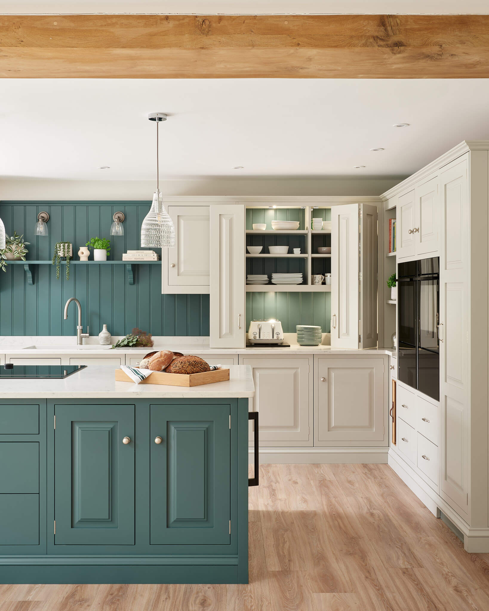
Family space was a priority and they wanted the kitchen to work for not just for when it the two of them, but also for when their extended family and grandchildren were there for day-to-day visits as well as larger family get togethers. It’s a big space and so hitting the brief in terms of worktop space and storage was fairly easy. They also wanted to create a ‘wow factor’ when people entered the room!
Q: How did you answer that brief?
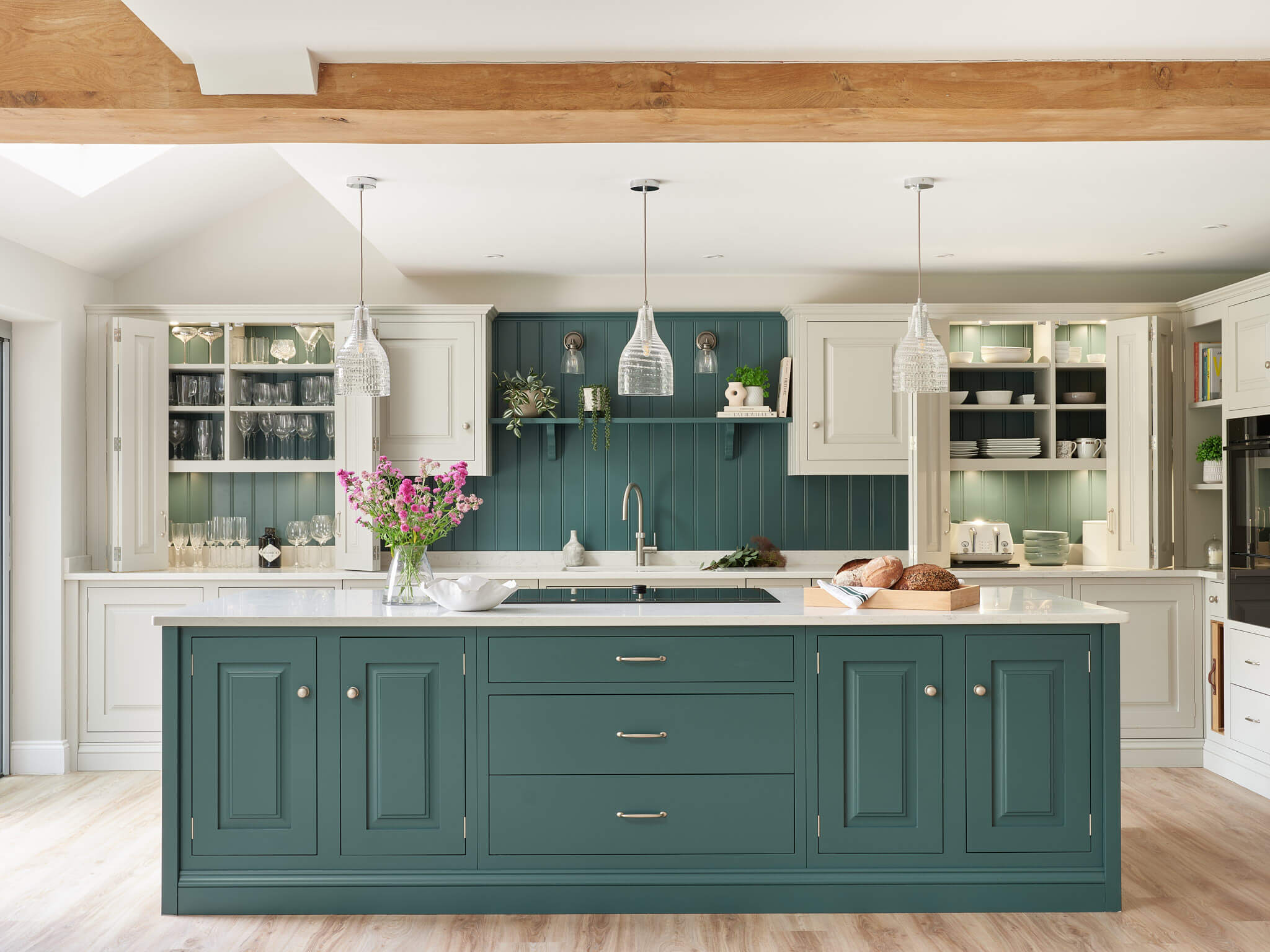
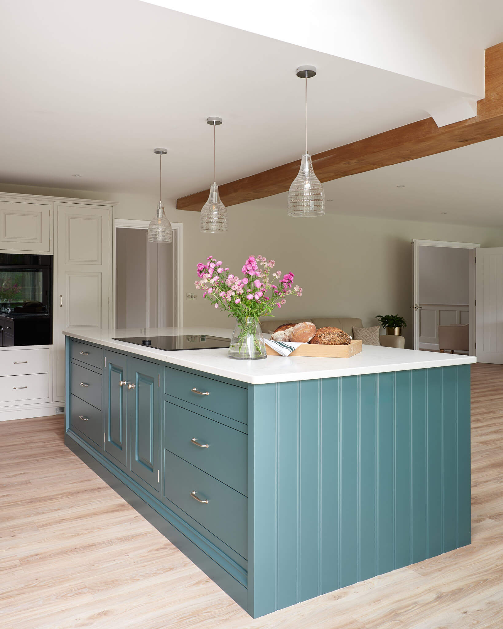
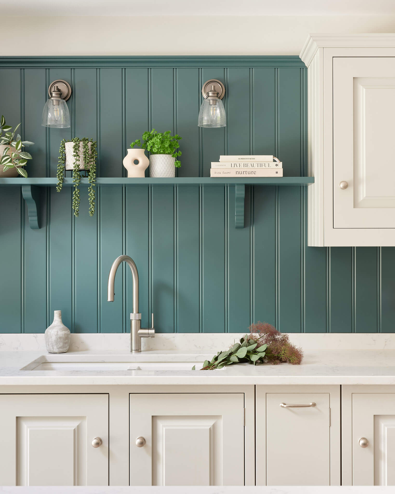
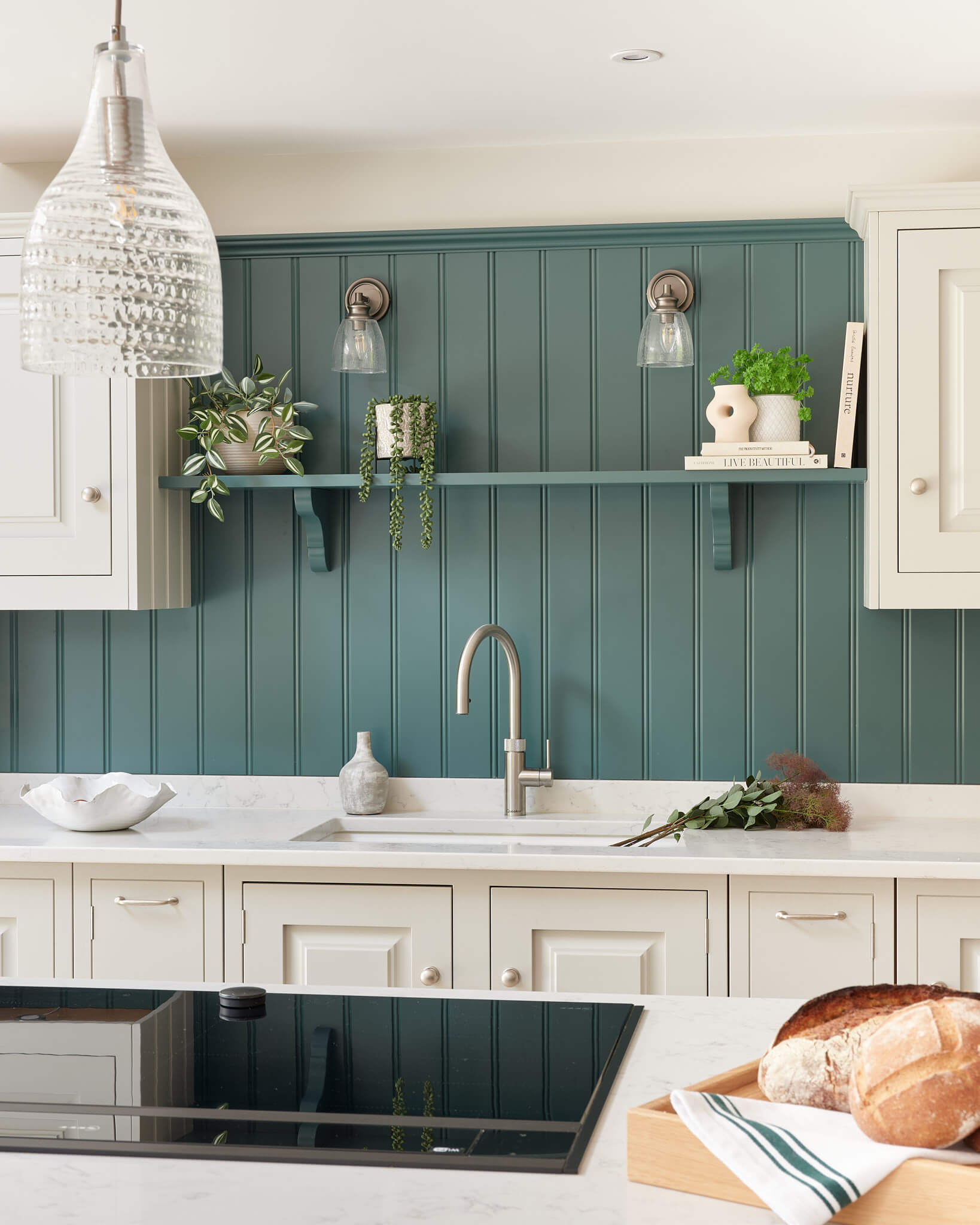
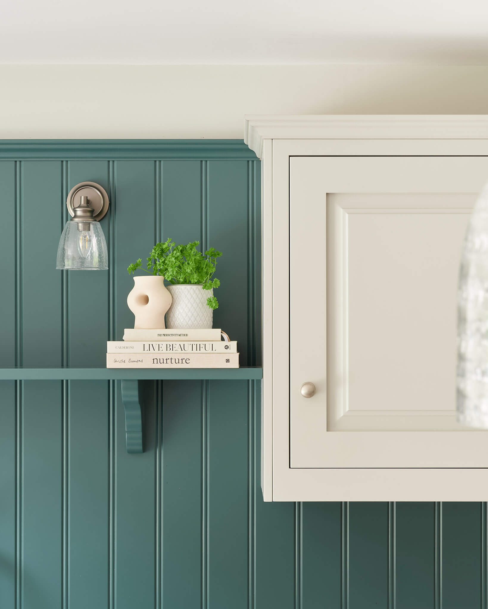
The wow factor came partially from the colour. Initially we were looking at a more neutral dark blue for the island but our clients fell in love with a bolder colour so we ran with this for the island. The colour also worked brilliantly for the tongue and groove wall boarding and the interior of the worktop mounted cupboards, giving a very impactful effect. The symmetry on the back wall was really important, so a lot of care went into this aspect of the design.
Q: Was the project a renovation or a new building?
A bit of both! Our clients bought the house as a complete renovation project, as well as building a new extension to the back of the house, which is where the kitchen is located, creating a much larger dining area and relaxing social space.
Q: Did the design change dramatically at any point?
Yes! Initially I had designed the island to have space for four stools, but this changed fairly early in the revision stage to instead accommodate more storage on the island. There is a large dining table next to the island and so bar seating wasn’t as much of a priority.

Q: Explain the reasons behind the choices of colours, cabinetry and work surfaces …
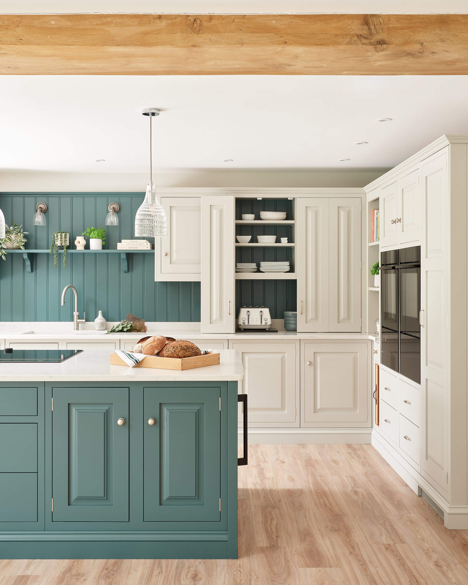
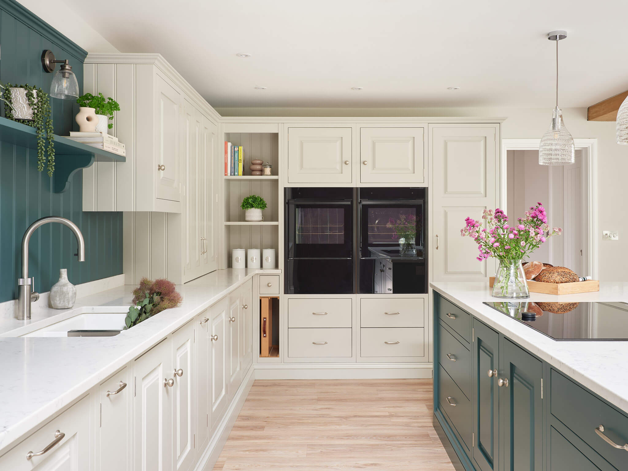
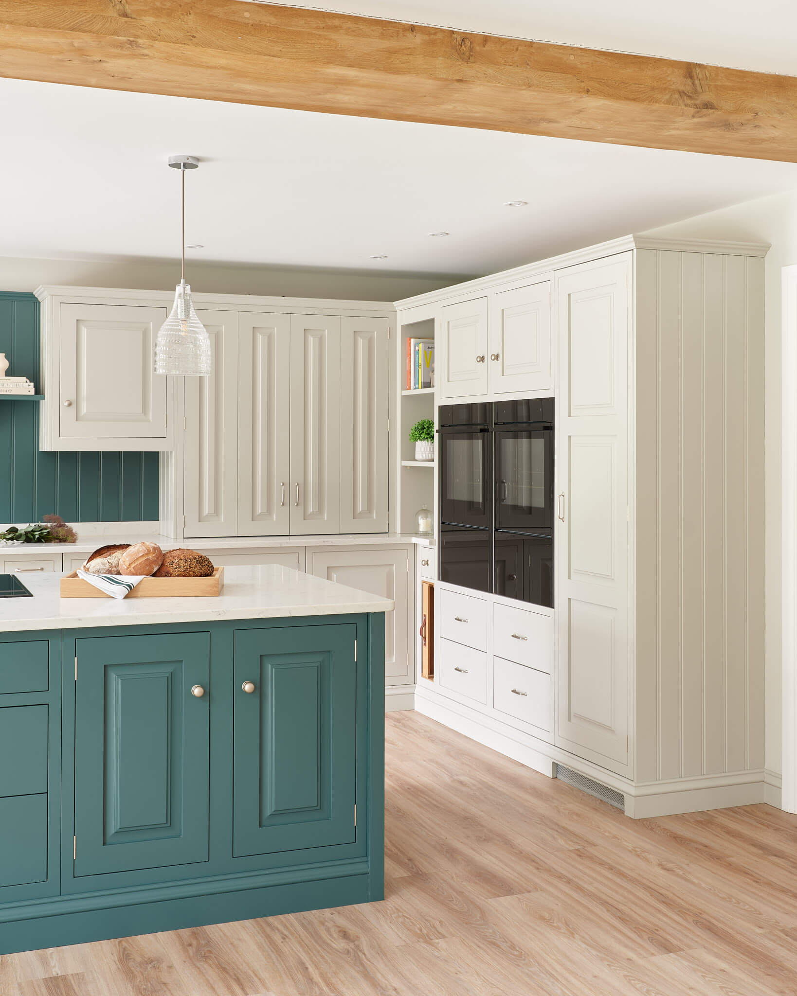
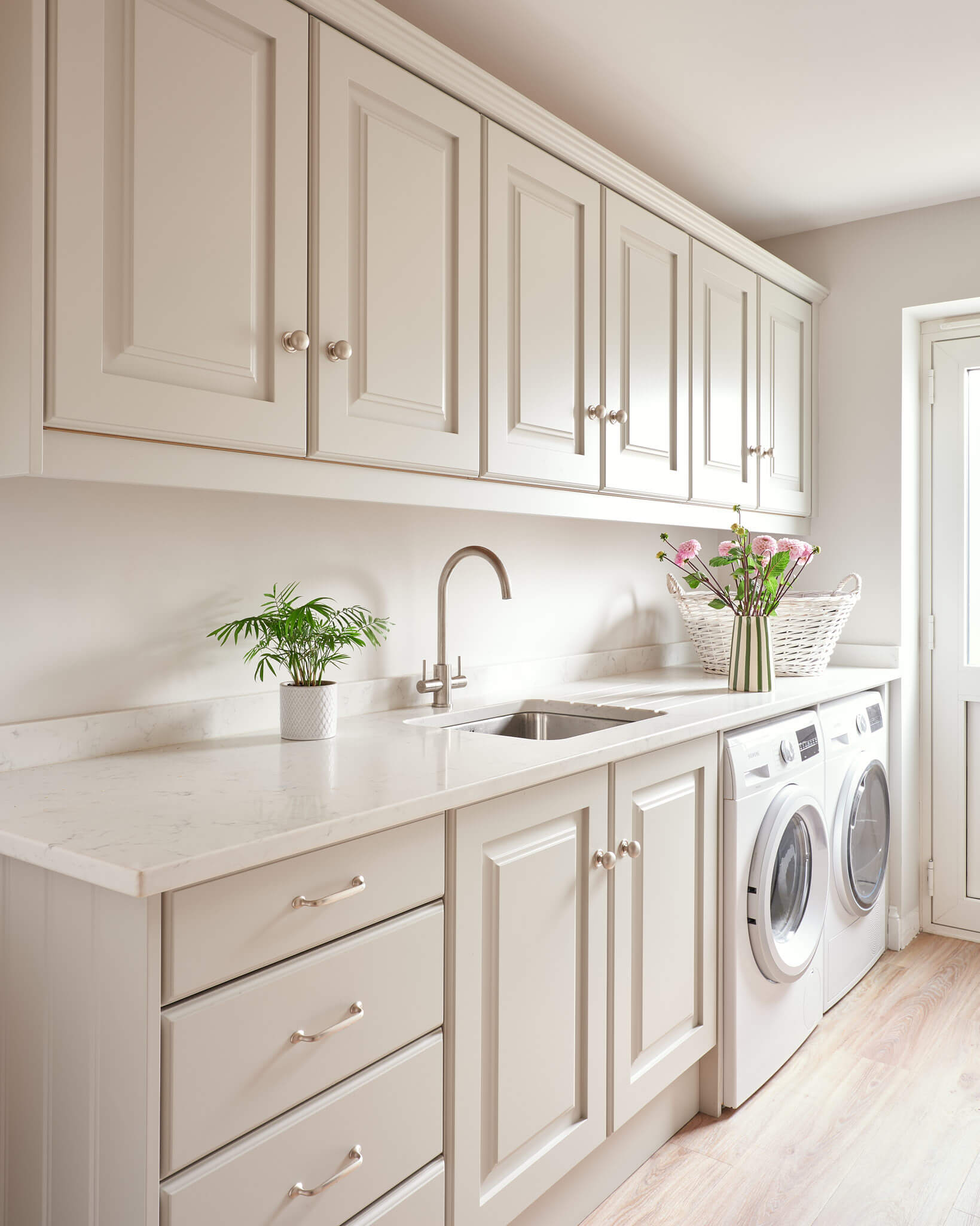
The cabinetry our clients favoured is our Artisan door style. It was manufactured here as in-frame and with the additional detail of the architectural style skirting rath than a rebated plinth to elevate the look. The paint colours chosen are our own paints – the neutral colour is Mouse and then the beautiful blue-green is called Darwin, one of my favourites to work with! The work surfaces are a Quartz by CRL called Verona.

Q: What storage elements do you think work particularly well?
The work surface mounted units are always a winner, as they are so flexible in their functionality. Here one is used for all the glasses and drinks, rather like a cocktail cabinet, and the other is more of a breakfast cupboard, hiding the toaster and crockery. As a designer, I also really love the little open shelving unit tucked into the corner next to the tall units.
Q: What design elements do you think make the scheme so successful?
The symmetry which stretches along the sink run and the tongue and groove wall panelling and colour really make this kitchen impactful. When the doors are open on the worktop mounted units it looks like the paneling runs the length of the wall. In reality this is the backs of the units and separate wall paneling in between. Without this paneling and shelf the look would be very different. Although I am an advocate for not having perfect symmetry sometimes, and tend to lean toward having balance rather than symmetry to create interest, here the symmetry works particularly well and was important to our client.
Q: Now the project is finished, what aspects are you and your clients most pleased with?
I love the overall feel of the space and particularly, our clients’ colour choices! The room is quite calm and neutral and the Darwin shade just gives that pop of colour and interest. Our clients are really pleased with the space they have around the island – they can be cooking at the hob when the family are round and still be socialising and chatting. They find having the table by the island is really functional for hosting.
Q: What is your best advice for someone who is planning a new kitchen?
As a designer, the better the brief we can take from a client, the more we have to work with to make sure the kitchen is going to be perfectly suitable. You could take the same space and do several different designs depending on the brief. It is worth having a good think about not only the aesthetics such as the door styles and colours, but also any particular items you need to store or display, and what you know doesn’t work for you now or hasn’t in previous kitchens! A non-wish list is almost as important as a wish-list!
Q: Do you have a secret ‘style signature’ or item/feature that you find you use in most of your kitchen projects?
Not particularly. I am a fan of encouraging clients to have what they want for their kitchen, as every kitchen we design is completely individual. Unless you’re flipping the house of course, in which case practicality and budget may become more of an issue. But if our client is planning on staying there for the foreseeable future than I think it is very important to create every opportunity for them to have exactly what they want. Sometimes clients are thinking about what other people will like, and I understand that to a point. But … a kitchen is a big purchase, and you’re the one using and looking at this kitchen every day, as well as the one paying for it! So if you want a bright yellow kitchen and it’ll make you happy then just go for it!

Q: Are you seeing more large-scale projects that include other rooms, such as boot room, utility, walk-in larder and so on …
We do see a lot of multi-room projects. We also make bedrooms as well as kitchens, which are manufactured slightly differently. So between the two options we can work on nearly any room in the house – boot rooms, larder, pantries, media runs, studies, bedrooms, walk in wardrobes, and bar areas. Often our clients would like there to be a style that flows through the house and so will come to us to design a few different space. There is then the same cabinetry and ‘feel’ in several rooms, creating a linked flow throughout. We love that we can achieve this for them
Q: What are your trend predictions for 2026?
I think we will continue to see a lot of green shades next year and continuing interest in natural materials and finishes. Replicas of natural marbles colours and patterns in man-made products such as porcelains win on the functionality aspect over real marble. Colour blocking and the use of colour to add either just a splash of interest or as a whole look. We will be seeing fewer greys and whites and an increase in beige and warmer tones.
Kitchen and utility project by John Lewis of Hungerford, Tel 01234 774300, E: sales@john-lewis.co.uk
Follow on Instagram @johnlewisofhungerford
Showrooms include Beaconsfield, Blackheath, Cirencester, Cobham, Fulham, Hungerford and Muswell Hill.
Tap, Flex in stainless steel, Quooker
Sink, Paragon in Crystal White, Rangemaster
Wine cooler, Siemens
All other appliances, Flex collection with black trim, Neff

Share this article
Featured Product: LEGRABOX
Win a Blum ORGA-LINE box worth £320!!!
Every month The Kitchen Think is giving away one of these indispensable kitchen organisers worth £320!!


Leave a comment