
Dramatically Dark
By Linda Parker
It’s a joy to see adventurous colours used in glamorous kitchens … however sleek and gorgeous a pure white kitchen looks, a darkly dramatic kitchen space takes the look up to a higher level.
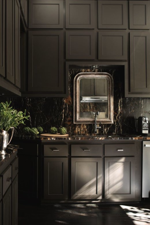
Cabinets in Iron Mountain 2134-30 by Benjamin Moore, providing a perfect contrast to the marble splashback.
We’re reeling with delight at the combination of the Iron Mountain colourway (cabinetry) and marble, with the clever idea of using an opulent mirror as a ‘splashback’. Protect a mirror frame by giving it an extra coat of clear matt varnish, and try not to be too splishy-splashy when washing up. If your kitchen could do with an update but is in good condition, then the tried-and-tested way of transforming the whole scheme is to give the cabinetry (and other woodwork) a brand-new look with a striking painted finish. Walls and ceiling can also of course be refreshed at the same time, and ‘using the same, or similar, tones creates a very pulled-together look.
Helen Shaw, Marketing Director of Benjamin Moore Paint, says ‘Ultimately, of course, colour choice is down to personal preference. We suggest deciding what features of the kitchen you want to draw attention to … if you’d like the island to stand out, then opt for a bold and contrasting colour. If it’s the worktops that have benefitted from an investment in marble, for example, use a subdued shade for the cabinetry, allowing the colour of the surfaces to stand out. The level and degree of contrast is important, it sets the tone for the rest of the colour scheme. One useful design trick is to use the same colour for both walls and cabinetry – it will create a wow-factor statement scheme’.
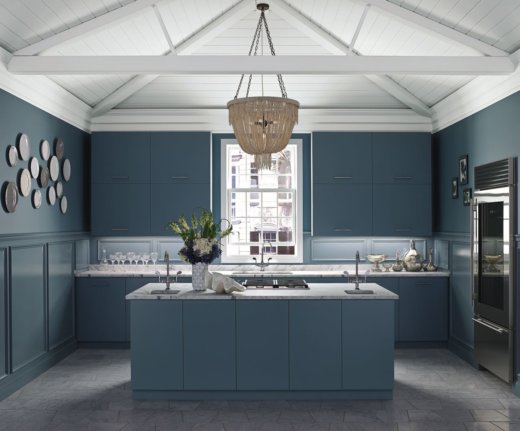
Statement colour scheme in Province Blue 2035-40 for the walls, cabinetry and panelling; Baby’s Breath OC-62 for the ceiling; all Benjamin Moore Paint.
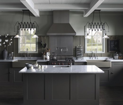
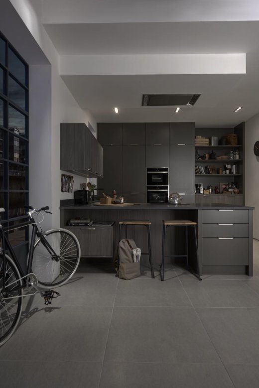
Gorgeous greys … Walls and ceiling in Stonington Gray HC-170; panelling in Sparrow AF-720; cabinetry in Iron Mountain 2134-30; all Benjamin Moore Paint.
Dark grey isn’t the first shade that springs to mind for a kitchen, but as we’ve shown here, it can work beautifully, both in a jewel-like small kitchen or in a more spacious light-filled kitchen as seen above. Remember, symmetry is vital in larger kitchens, otherwise the layout becomes sprawling and unruly. The genius idea is two large sinks … of course, it’s not something that every kitchen can accommodate, but works well in a busy space that’s perhaps used by two home-chefs at once!
As far as choosing colour is concerned, the crucial thing is to evaluate shades in natural daylight, bright artificial light and more subdued mood-lighting for when guests are gathered around the kitchen table or breakfast bar. Helen Shaw advises ‘Always find time to study and observe how colours look and feel in your kitchen space at different times of the day. Daylight, the direction of the sun, the times that you use the kitchen the most and whether there are blinds or curtains all influence subtle changes of colour perception. It’s always worth the time spent trying out similar shades under different lighting circumstances before committing to a huge change of colour scheme’.
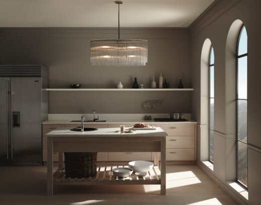
Wall colour and cornice colour, Silver Fox 2109-50; ceiling colour, Pink Damask 0C-72, all Benjamin Moore Paint.
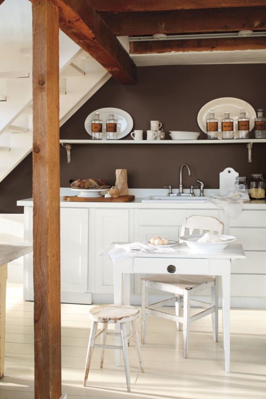
If you’re not up for a complete change of colour, but would like to spice up an existing plain or subtle colour scheme, simply painting one wall area in a contrasting colour can do the trick. Below, a basement kitchen in white and cream was looking a little bland … until the back understairs wall was given a new look with French Press AF-170.
The practical low-down: Don’t be daunted by the thought of re-painting gloss or laminate finishes. Prime a gloss/laminate surface with an adhesion promotion primer … such as Stix from the Benjamin Moore Paint range. Advance Waterborne Interior Alkyd paint can then be used for the final coat. As it’s water-based it’s far easier to use and clean up than oil-based paints but will still result in a brush-mark-free finish. See the whole paint range here. Other ideal kitchen colours include Kensington Blue 840; Graphite 1603; Sage Mountain 1488 and Dolphin, AF-715. Finishes include Advance Waterborne Interior Alkyd in Satin and High Gloss; Aura in Matte, Eggshell and Satin.

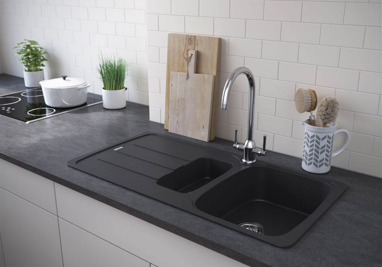
As I may have mentioned before, I’m always in favour of stainless steel or a dark colour for a kitchen sink (from a perfectly practical point of view, having a family where absolutely no-one can make a cup of tea or coffee without sploshing). So, the new Calla 150 Granite sink from Carron Phoenix caught my eye immediately. Shown above in Jet Black, it also comes in Polar White and Champagne for less messy families! It’s scratch resistant, temperature resistant up to 280 Deg C and has Sanitized ®anti-bac protection. And the best thing … it’s very affordable, at £329. See the whole Carron Phoenix range here.
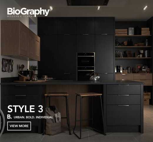
For a darker industrial look, the Biography Style 3 kitchen features Matt Lava handleless doors, plus a Graphite accent feature door, with a Strata black linen granite work surface. The Biography range is from an affordable £10,000, from independent Biography retailers.
Now, if after all this news of desirable dark colours you’re looking for something to brighten the day, look no further than the Breadboy range by Wesco. Bright yellow is hitting the high street, from summer sandals and handbags to ceramics and kitchenware. We love the Single Breadboy breadbin in Lemon Yellow, £54.95 and its partner, the Baseboy 15-litre pedal bin, £129.95. Both by Wesco, find you nearest stockist here.
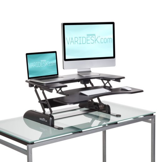
And finally, … if you’re fed up of hunching over a laptop or desktop screen, it’s time to consider adjusting your working conditions! Having suffered from a back problem for a couple of years which meant I had constant pain when sitting down, I started to stand up to work – with my laptop stacked up on the breakfast bar on top of a pile of glossy magazines (sturdy and sound-absorbing!). Then I was asked to review the Varidesk. Joy of joys, one arrived for me to try out. I must say it’s a brilliant concept. The one I had (the ProPlus 36) is a grand-scale version. It’s too big for my set-up, but rises and falls effortlessly, is comfortable to stand and work at, and a must-have investment for anyone whose shoulders are aching and posture is suffering. See the range here, but look carefully at the dimensions, and choose accordingly. Well worth splashing out for a straight back and the feelings of positivity and alertness which come from working comfortably – a very welcome knock-on effect!
Share this article
Featured Product: LEGRABOX
Win a Blum ORGA-LINE box worth £320!!!
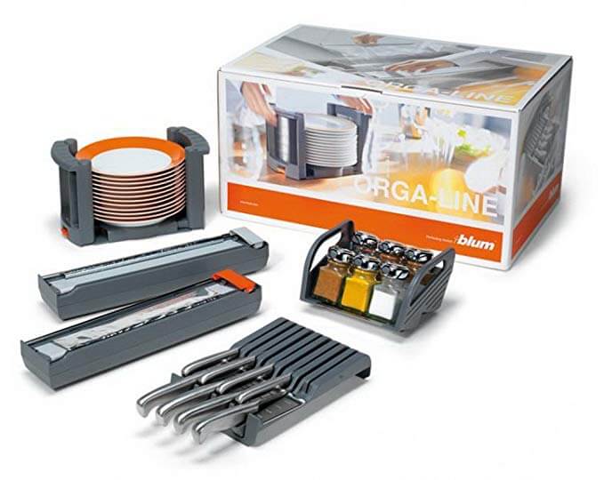
Every month The Kitchen Think is giving away one of these indispensable kitchen organisers worth £320!!
Join us on Instagram


Leave a comment