
Dulux Colour of the Year 2024 – how to introduce pale pink into the kitchen
Every year we excitedly wait to hear what the Dulux Colour of the Year is going to be and 2024 does not disappoint with Sweet Embrace ™ announced as the mood of the moment. This delicate tone is soft and subtle, positive and uplifting and perfect for adding warmth to any room. But what about the kitchen? We’ve got all you need to know on how to use this calming colour as a culinary accent.
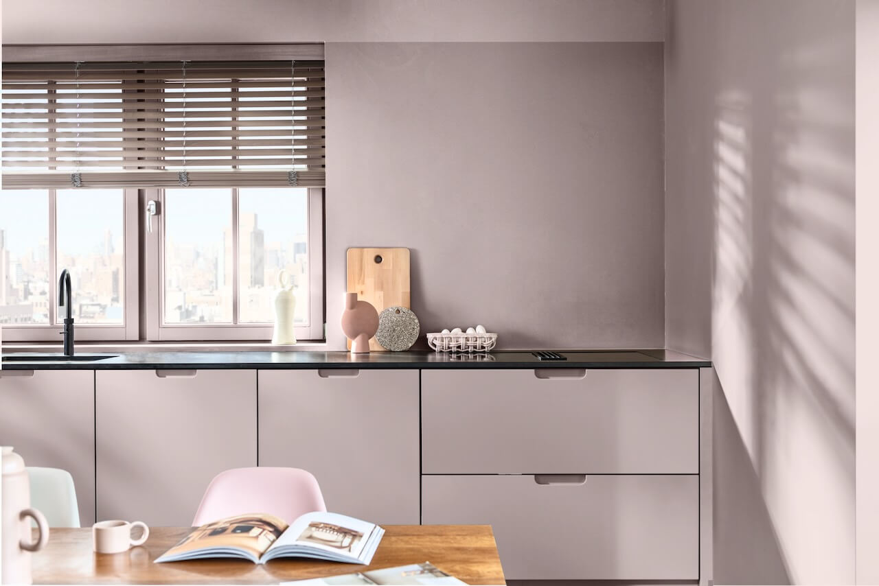
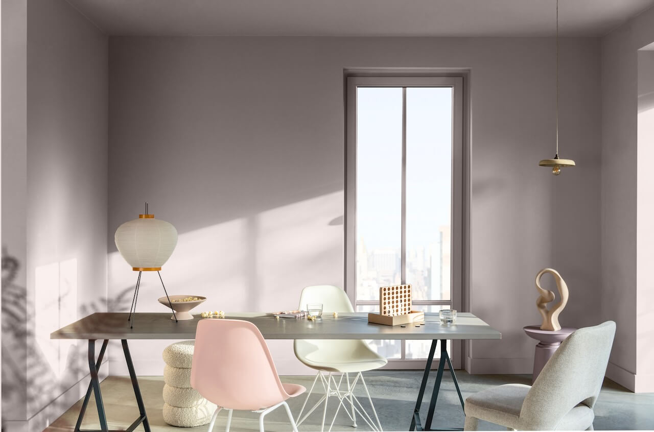 Dulux Colour of the Year 2024, Sweet Embrace ™
Ruth Lavender, design expert at Benchmarx Kitchens, has some fabulous ideas on how to incorporate this colour as well as similar pink hues into your kitchen space…
“Welcoming pink into your home is a great way to inject a feeling of feminine fun. Pink is a beautiful, timeless colour that can be used in many ways across the home. Whether you go big and bold or introduce the colour through subtle accents – incorporating this colour in the right way will ensure your scheme never tires.
“Your choice of shade and how you add it to a space will have a real impact on the overall look and feel. The pink palette is varied, with shades ranging from baby and blush to candy and fuchsia – all of which imbue warmth and cheer. The pastel end of the spectrum is generally most favoured in home interiors due to its versatility and flexibility to pair with so many different colours.
“Blush is a shade of pink that many are drawn to, especially in the kitchen, where people tend to want a colour that will both reflect their personality and stand the test of time. To add a hint of this hue without it feeling overpowering, the colour can be used on just an island or lower cabinetry, with a more neutral colour such as taupe or grey on surrounding cabinets to balance the scheme.
“Alternatively, use it across cabinets in the entire kitchen and team with a pared-back splashback and white worksurfaces or darker handles and accessories to create a more masculine look.
“If you’re not ready to commit to pink cabinets, add hints around the room, through accessories such as vases, plant pots, utensils, and crockery – this way you can swap out if you fancy a change. Here, you may want to go bold, incorporating statement patterns and shades that really make an impact.
“For a seamless look, extend the pink theme to your appliances such as your kettle, toaster and even your fridge. A pink splashback also makes a beautiful point of interest that will add a real flash of colour to even the most neutral of schemes.”
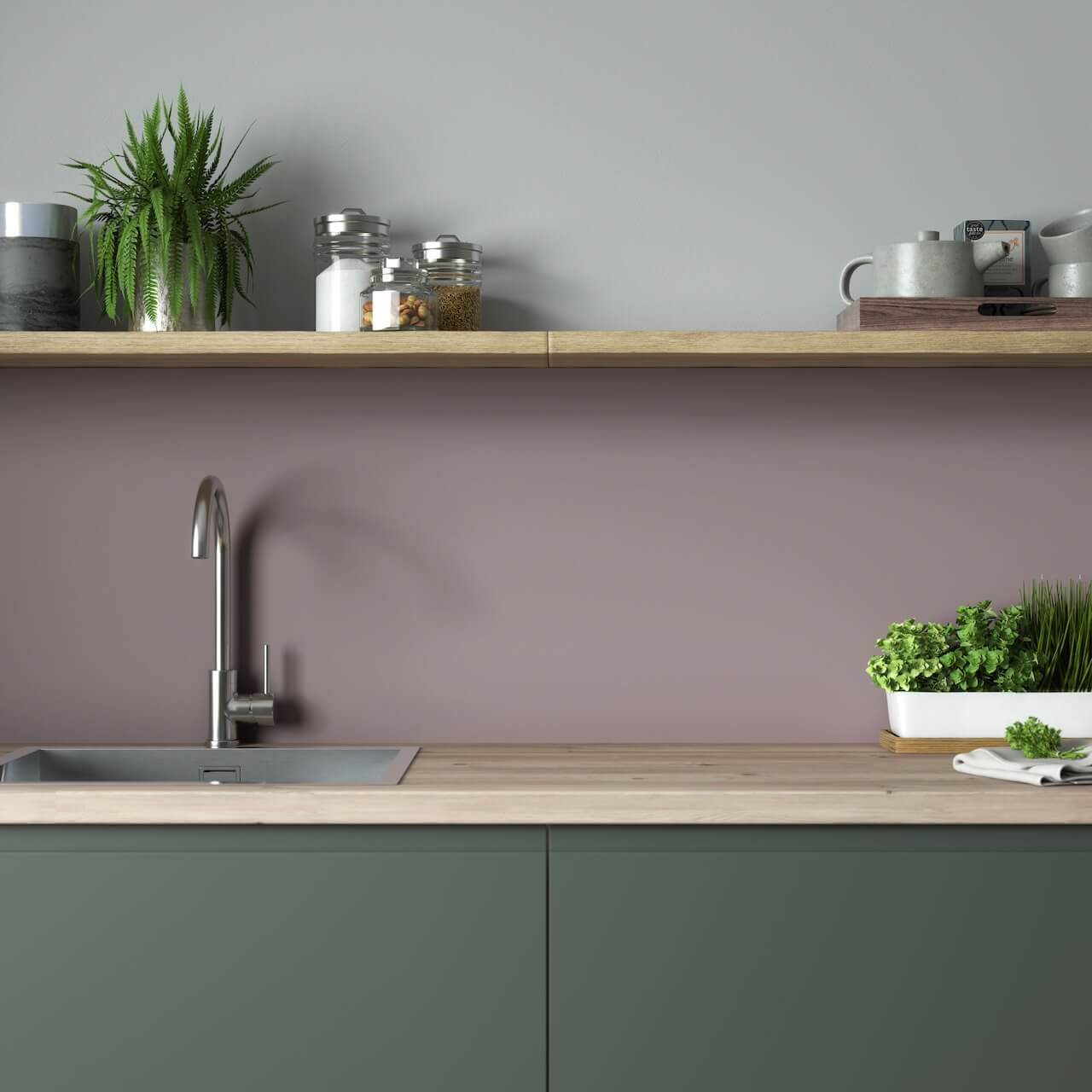
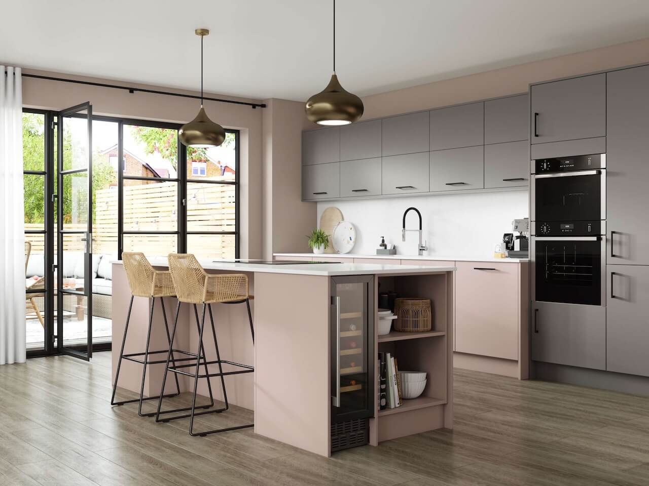 Benchmarx Kitchens’ Eton Serica in Matt Taupe with Bude in Matt Blush
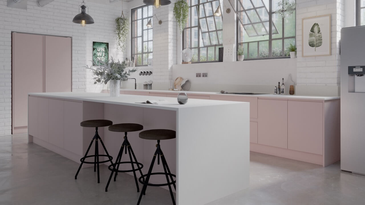
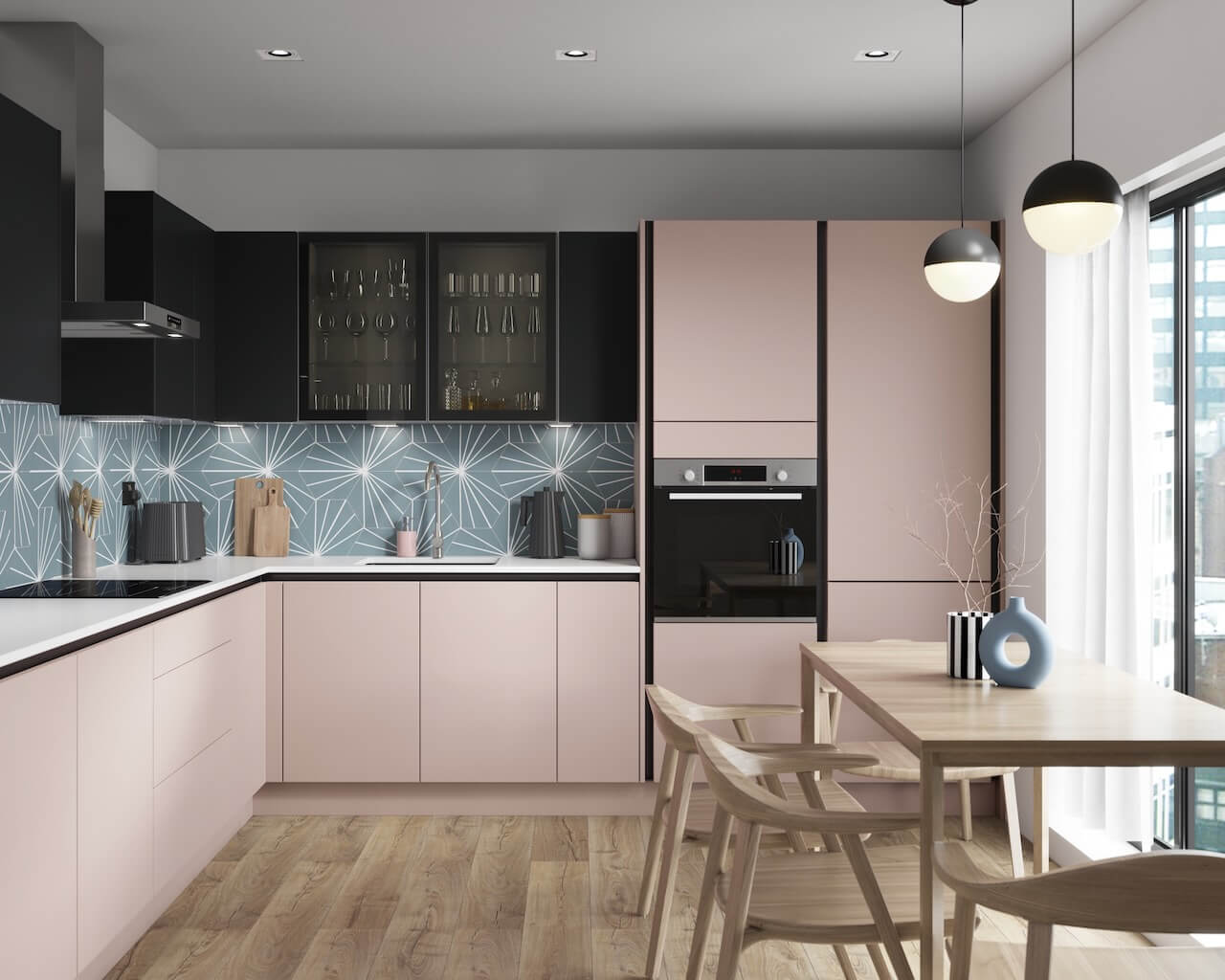 Benchmarx Kitchens’ Bude in Matt Blush
Meanwhile, Elliott Fairlie, product lead at Bushboard, has this advice…
“A sophisticated, delicate hue, Sweet Embrace evokes feelings of comfort and warmth when incorporated into the home. Whether you choose to welcome this shade into the kitchen with open arms or feature it as an accent colour, there’s no doubt that it will bring a feminine, fun finish to your space.
“If you choose Sweet Embrace as your wall colour, I’d recommend pairing it with neutral cabinet doors and complementing splashbacks and worksurfaces. Marble kitchen worktops work beautifully with soft pinks, resulting in a modern yet timeless scheme that oozes effortless sophistication. I’d recommend opting for a marble-finish kitchen worktop and bring it up onto the walls as a splashback or upstand to create a seamless design.
“For that modern farmhouse feeling, pair Sweet Embrace with Shaker kitchen cabinets and a wood-finish worksurface. Oak effect worktops and warm walnut-finish worktops work well with this hue, as it mirrors the warmth of the wall colour, creating a cosy, considered configuration.
“The fluted effect is a growing trend in interiors and looks incredible partnered with soft pinks, acting as a point of interest without taking the shine away from your wall and accent colour. No matter how it’s incorporated, the look provides an aesthetically pleasing ripple effect that adds a layer of texture that can elevate the space.
“You can also be playful with soft pink and pair it with darker colours – this will really help the pink pop. Soft pink works well with dark grey, blue and green cabinets as well as dark marbles and stones. This juxtaposition between light and dark can also be achieved in a more subtle way by opting for grey toned marbles and stones.
“If you’re not ready to commit to pink cabinet doors or walls, there’s the option of introducing it in a more subtle way. A solid-coloured splashback such as Smoked Rose from our Alloy range creates a clean, sleek finish while introducing an understated pop of colour.”
 Bushboard Smoked Rose Alloy splashback
Over at Smile Kitchens, design lead Jane Thyeson says…
“It’s a very calming and feminine colour and makes a good base for the walls to pair with the sort of wine-red tones that are going to be very popular next year. It also provides a gorgeous warm neutral backdrop that elevates the drama of black and brass accents. You could opt for Sweet Embrace as the cabinetry colour and pair it with a brass handle option or industrial black kitchen stools.”
 Smile Kitchens’ Jasper Doll
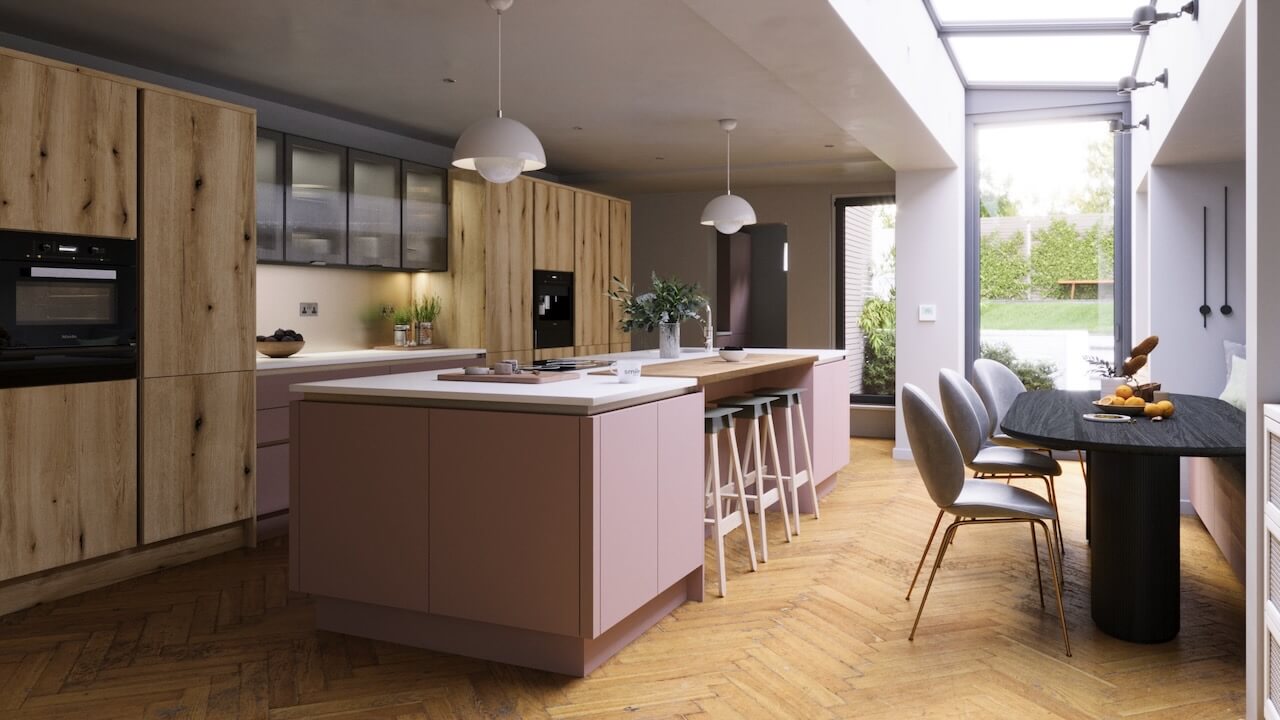 Smile Kitchens’ Linje
And to whet your appetite even further, here are some beautifully inspiring ideas from Kitchen Makers, Naked Kitchens and Cuisinart
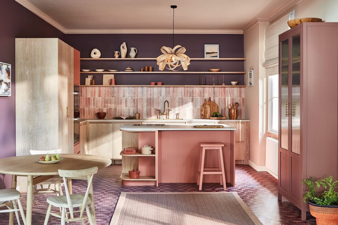
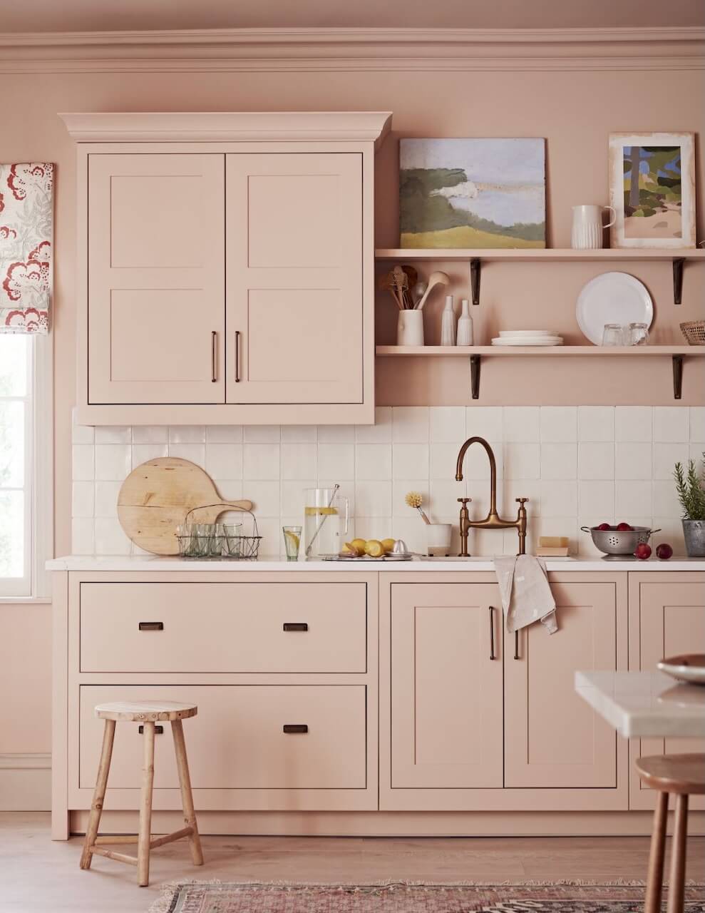 Kitchen Makers’ Haddon in Plaster
 Naked Kitchens’ Harpley
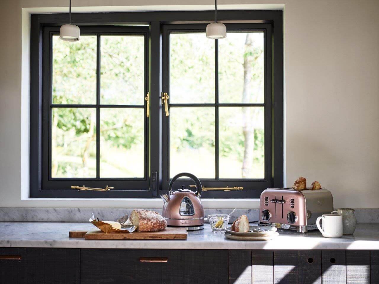 Cuisinart’s Traditional Kettle and 4-Slice Toaster in Vintage Rose
Share this article
Featured Product: LEGRABOX
Win a Blum ORGA-LINE box worth £320!!!
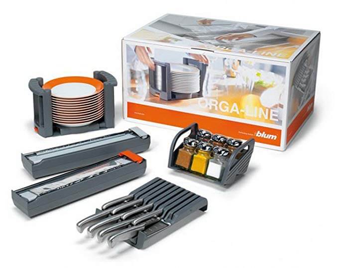
Every month The Kitchen Think is giving away one of these indispensable kitchen organisers worth £320!!


Leave a comment