
Elegant Curves: Pastel Green and White Kitchen by Kate Feather
By Linda Parker
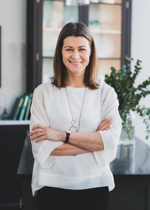 Kasia Piorko, founder of Kate Feather Kitchen Design, guides us through the story of this elegant and inspiring kitchen she designed for her clients in Notting Hill.
Kate Feather is the translation of Kasia’s Polish name into English if you’re wondering about the origin of the studio name…
Q: What did you want to achieve for your client in this particular project?
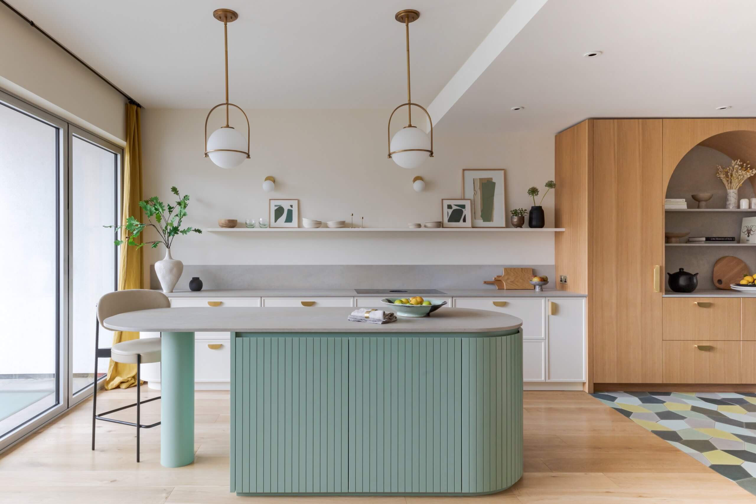
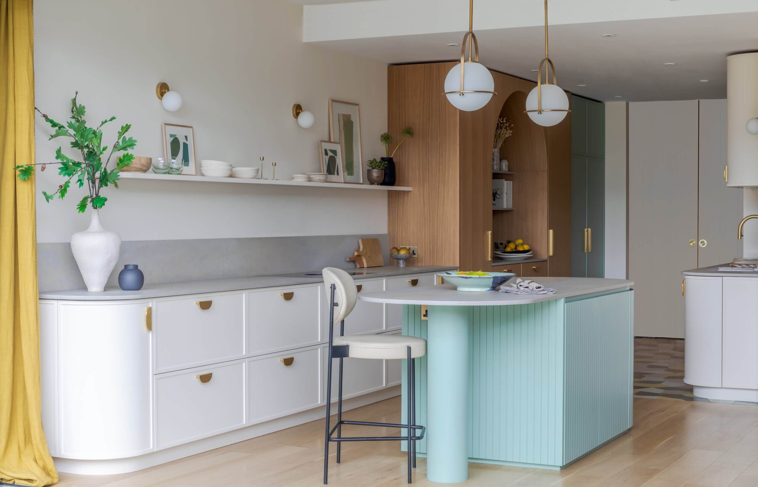
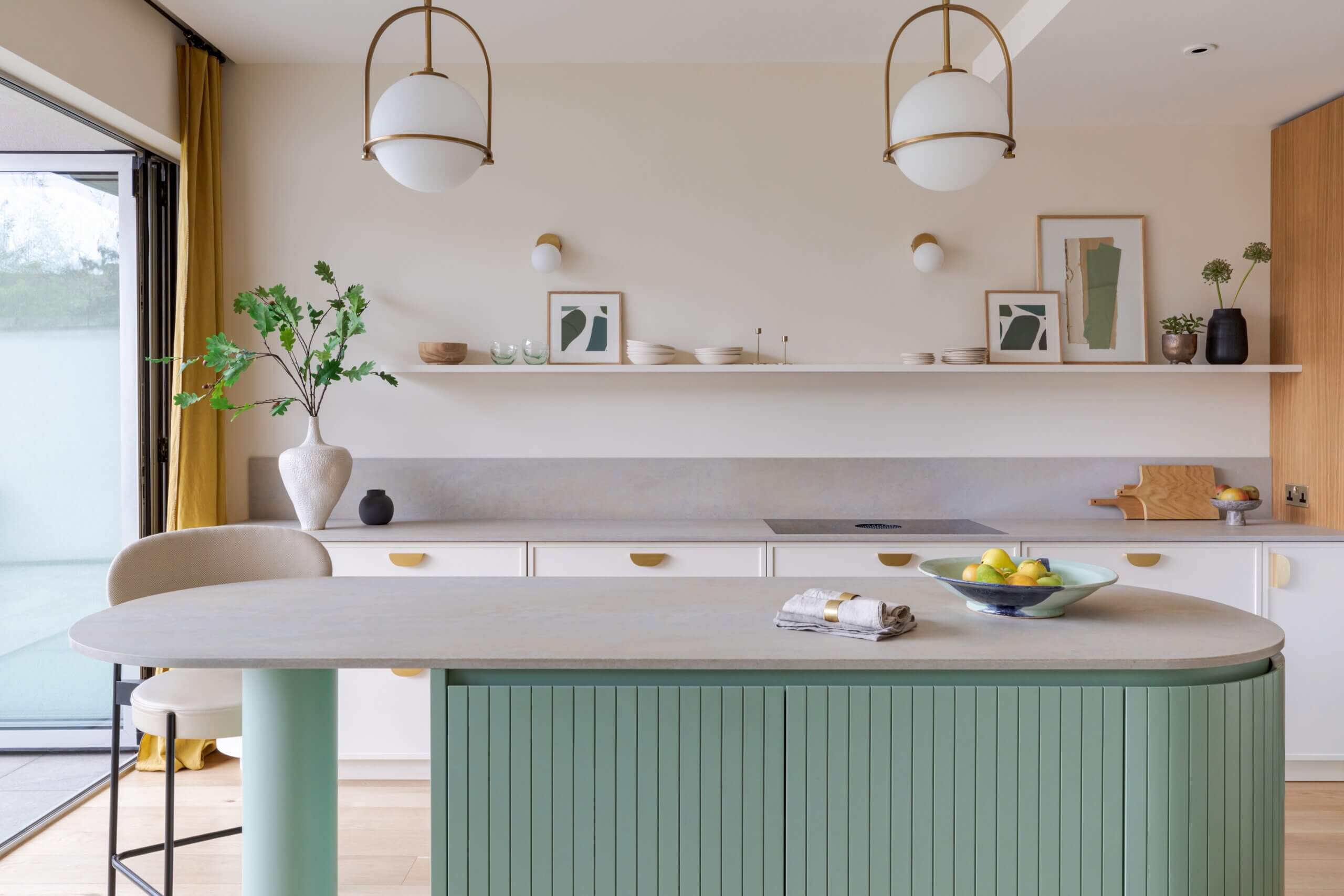
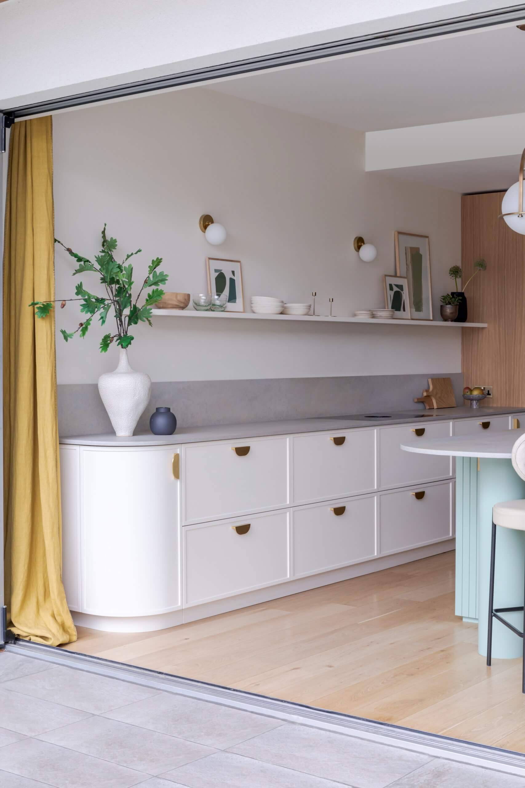
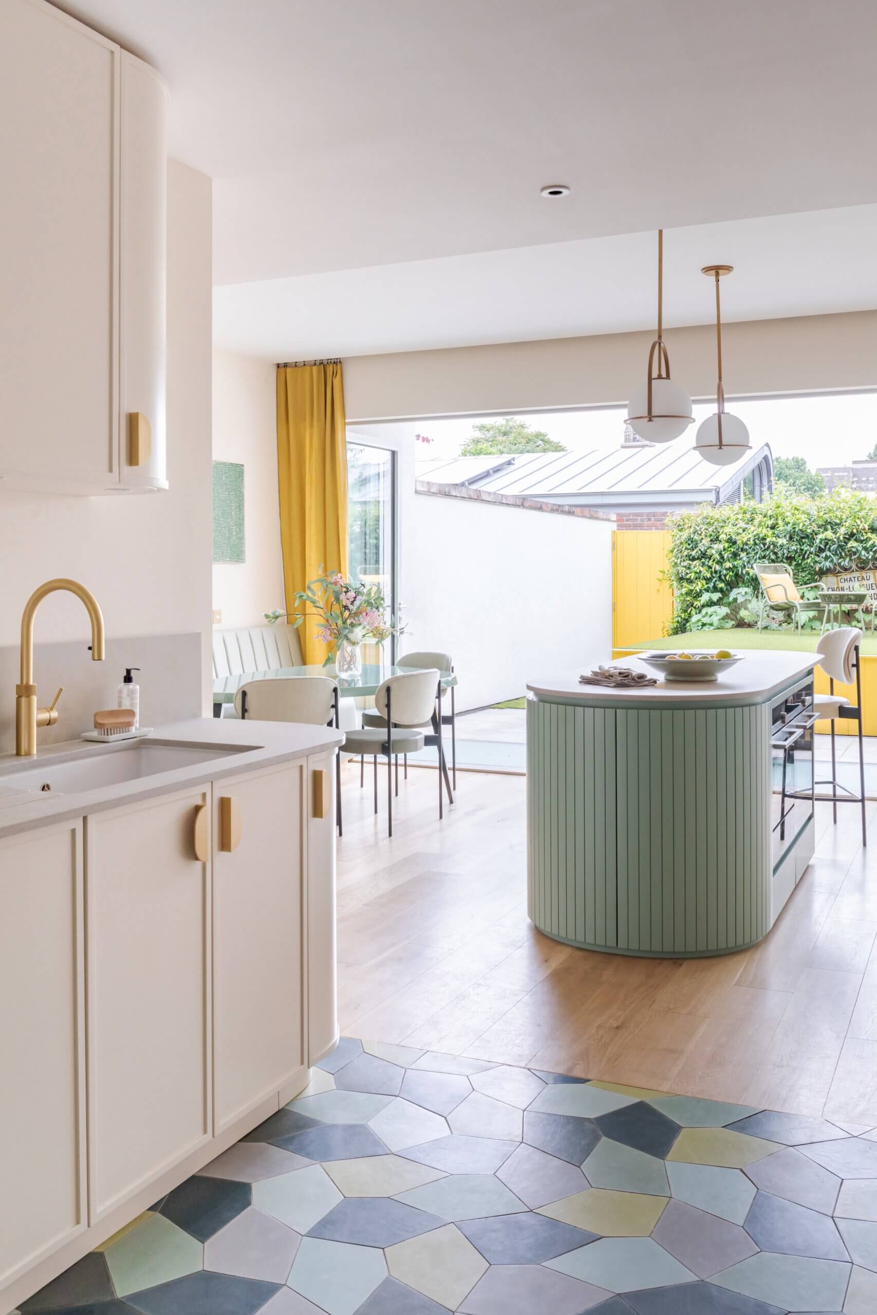
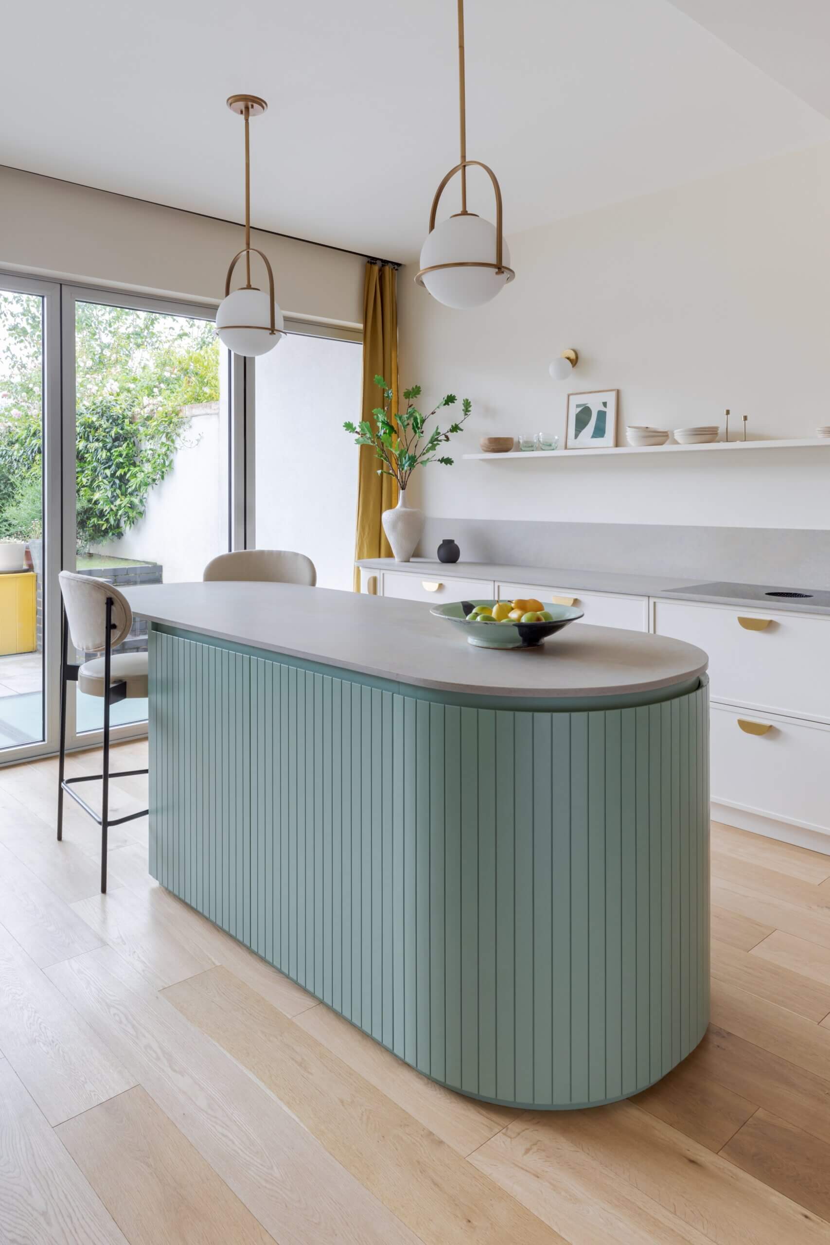
After an initial discussion with our client, we learned they wanted to create an interesting kitchen in a new-build space, introducing curves and texture for interest. As a designer, I could utilise different textures and colours to create different zones within this one long space. From that perspective, curves and colours, here we used a soft shade of pastel green with splashes of yellow, were able to bring a softer and more welcoming look to the kitchen – a room which is often full of harsh angles and straight lines.
Q: How did you meet your clients’ requirements?
We wanted to make the most of different textures and colours to create different zones within the one long space, which is the main kitchen, opening out into the dining area which has a round table. Both the dining area and the island area look over towards the garden, so there’s a lovely sense of space and light throughout. It’s designed to be a social and family hub – as well as a practical space.
Q: Can you describe the space you had to work with?
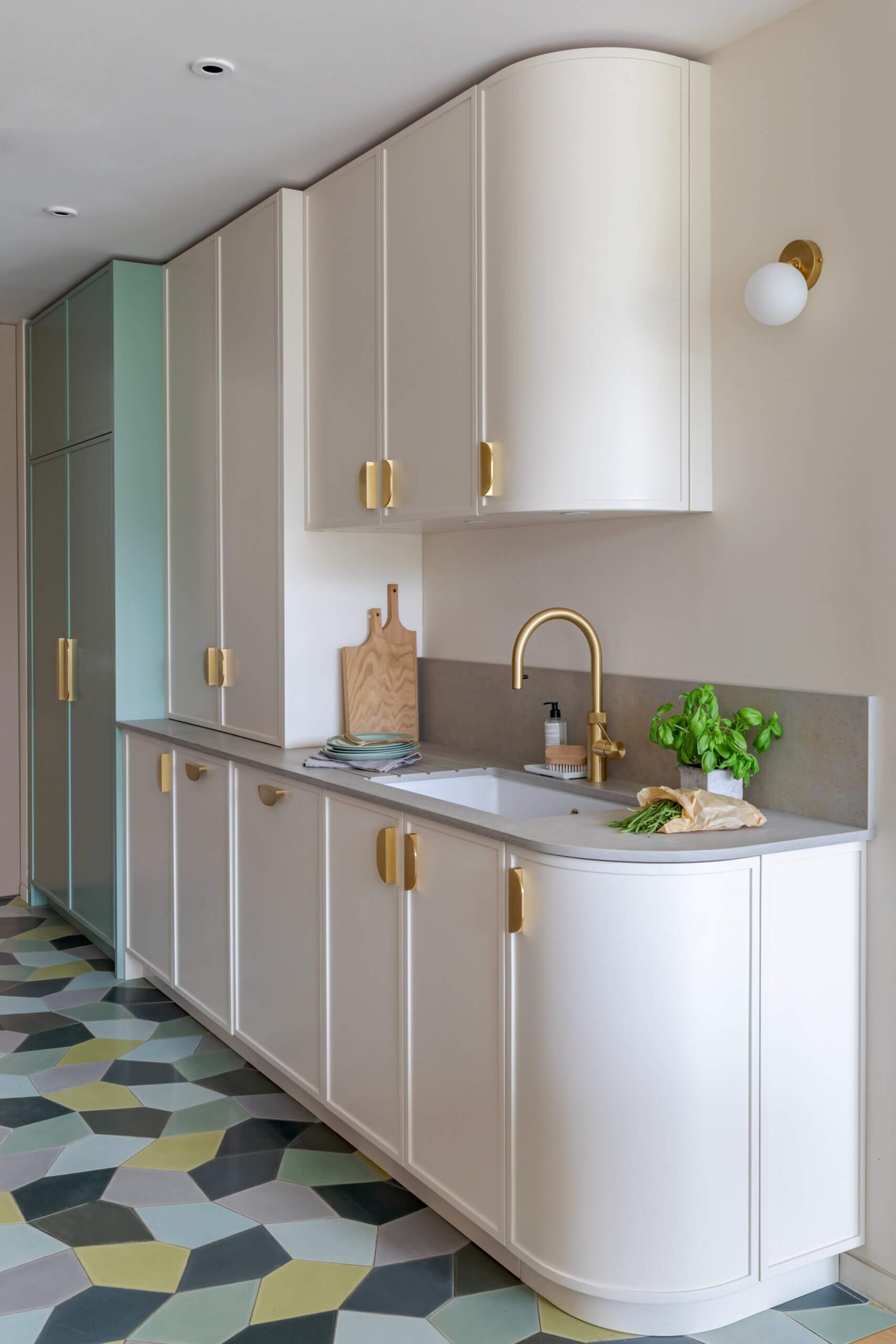
The main space is wide and bright, opening into and looking out into the garden, however the washing and food storage area of the kitchen is a narrower galley-style and could have looked a little dark compared to the main island/dining room space. Our challenge from our clients was to make the space work as a whole and create a beautiful, practical and colourful kitchen that had extensive storage, whilst not dominating the room. Using colourful mosaic floor tiles in the narrow part of the kitchen brought a feeling of a brighter space, whilst adding another layer of texture and interest.
Q: Can you tell us about your choices of finishes for the cabinetry and surfaces?
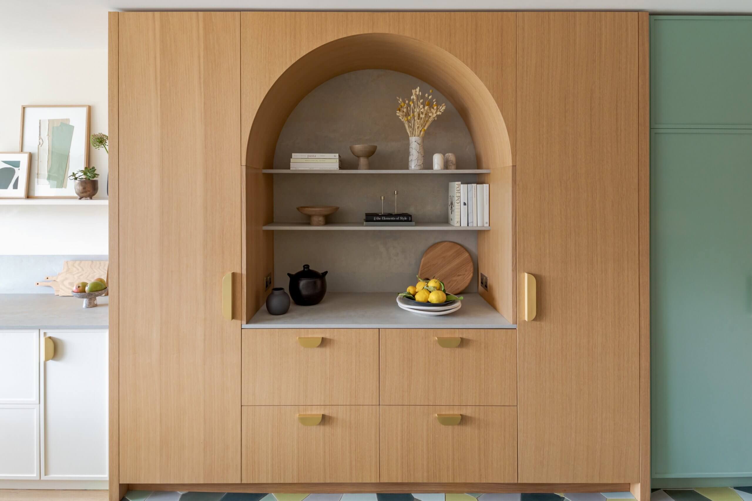
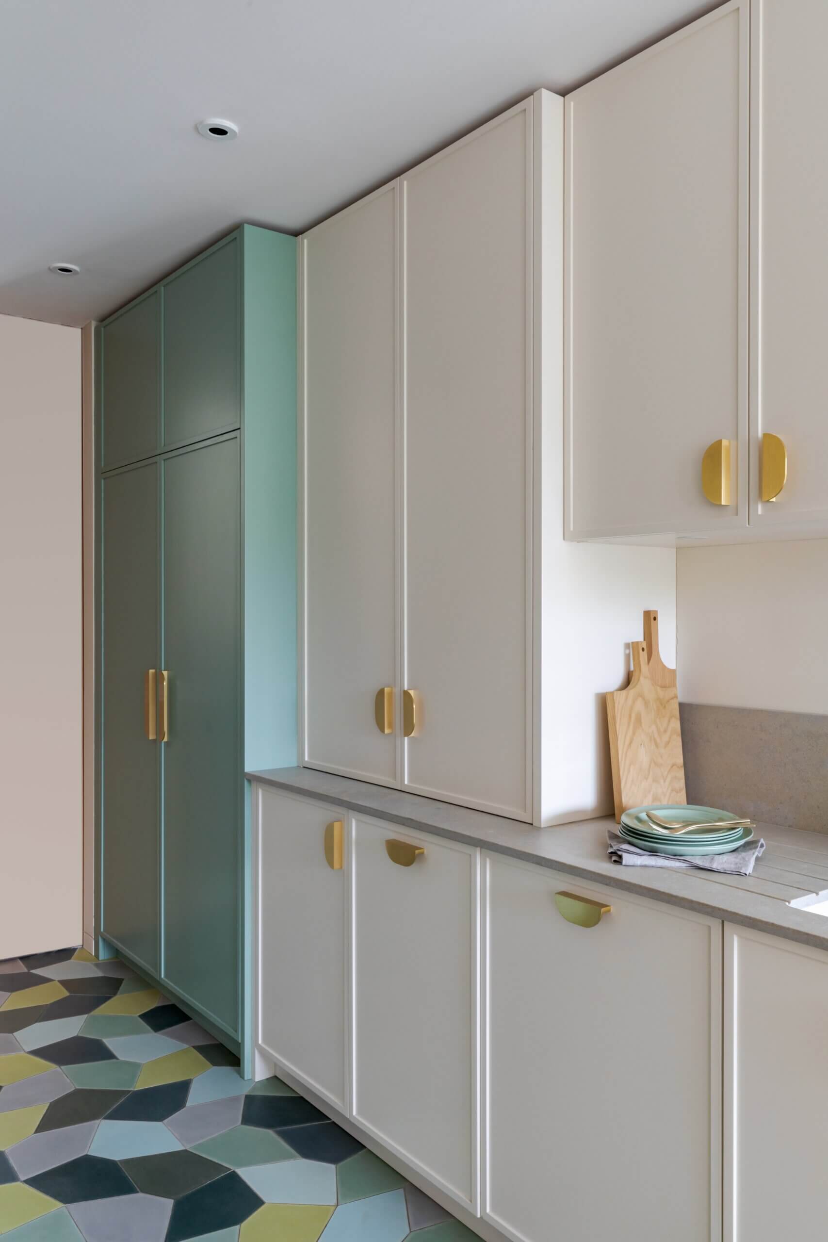
We wanted to create a timeless, contemporary kitchen that performed perfectly, was extremely practical and easy to work in, and yet which still incorporated a playful, family feel. Using colours which were warm and natural throughout the whole space, and some interesting curves and shapes helped to achieve this result. Practicality was a central aim, which was why I selected Caesarstone quartz for the work surfaces. Beyond just the looks and aesthetics of quartz material, it’s resistant to heat, is scratch and stain resistant as well, non-porous and easy to clean – so all in all, is a perfect option for a busy family kitchen. We chose 4023 Topus Concrete by Caesarstone and I really think that it’s one of the ‘wow’ factors in this project. The coloured cabinets (in Whitening and Aquamarine Deep by Little Greene) are hand painted, as the clients were keen to see the natural textures of the hand-painted brush strokes. The Grand Oak arched unit, in quarter-cut oak veneer, was chosen for it’s natural, textural beauty, and it’s linear details complements the geometry of the arch.
Q: What building work was involved, and did you have to make design adjustments to accommodate existing conditions?
We were working in a new- build space which had a kitchen fitted in, we removed a couple of stud walls and moved the plumbing to suit the new layout. Our clients had asked for units that reached ceiling height, so the fact that the ceilings were new and straight made that design and installation aspect nice and easy! The most challenging task, however, was to reinforce the cavity wall to support the quartz floating display shelf above the hob.
Q: What design elements do you think make this scheme so successful?
There’s a great combination of features in this project, it’s a wonderful mixture of colours, shapes, curves and finishes. We have the curvaceous island and arched unit, with painted and natural oak finishes. The floor is also a combination of colourful tiles and oak planks. The Caesarstone surfaces and upstands in the Topus Concrete colourway also add a subtle, muted thread throughout the whole space, which I think is a very successful element.
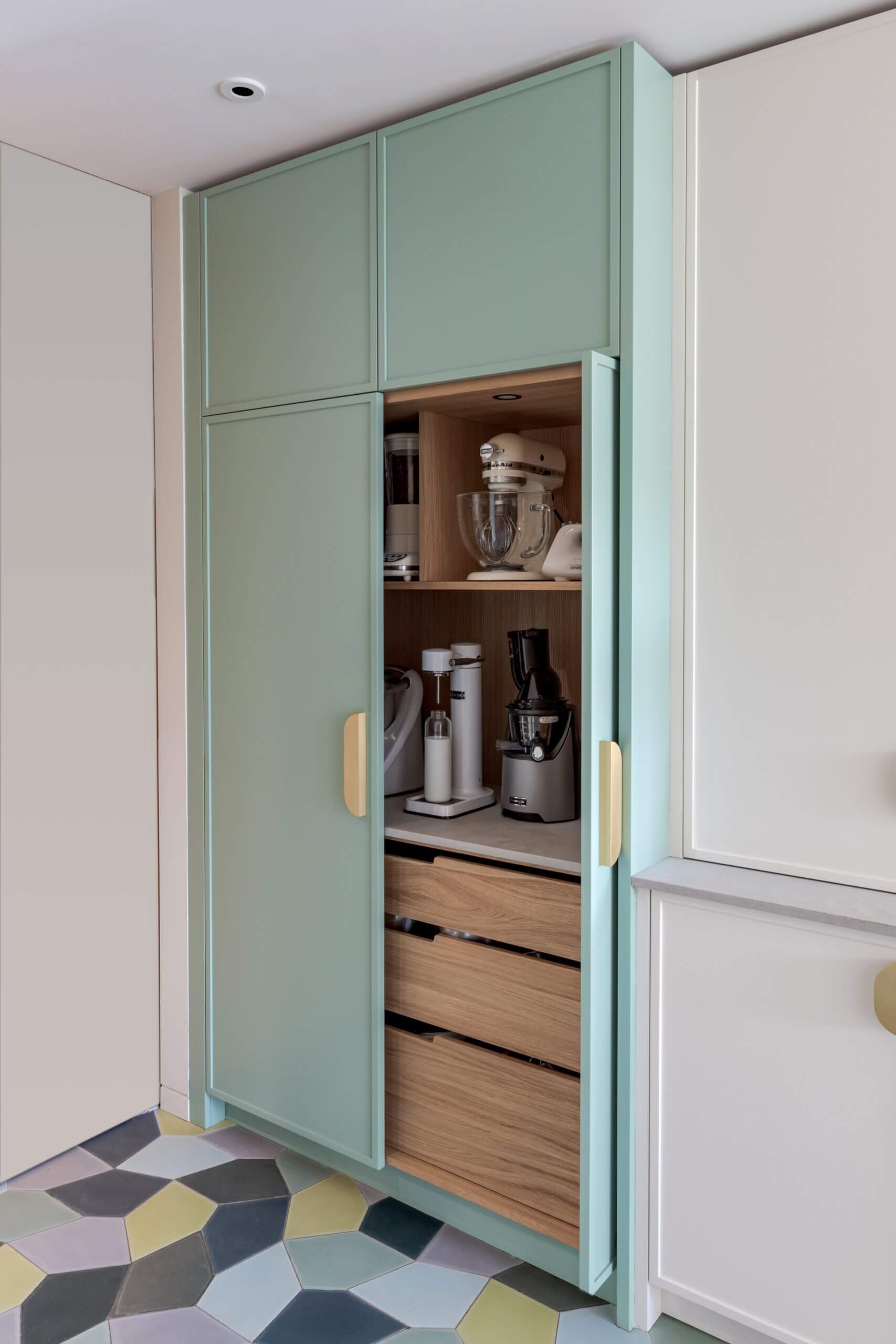
Q: What were the storage requirements you had to incorporate?
Food/grocery storage, and the pantry, fridge and freezer are all next to each other in a row, making it easy for our clients to access everything. The sink area has a counter-top unit with bi-fold doors which open to reveal a very well-stocked and useful coffee/breakfast station. The two tall oak doors of the arched unit conceal the fridge and the freezer, with a counter-top space in-between, so there’s a spot to put items once taken out of the fridge or freezer.
Q: Do you have a ‘style signature’
Not really, as each kitchen is unique and my style is to design a perfectly functional kitchen that has elegant proportions and fulfils all the storage, cooking and prep requirements that my clients have. However, I often include a slim floating shelf – they add a streamlined minimalist look whilst adding efficient display and storage space that doesn’t overwhelm. I like an element of colour as well, and we often suggest a bold cabinet colour, as a contrast to paler work surfaces and upstands.
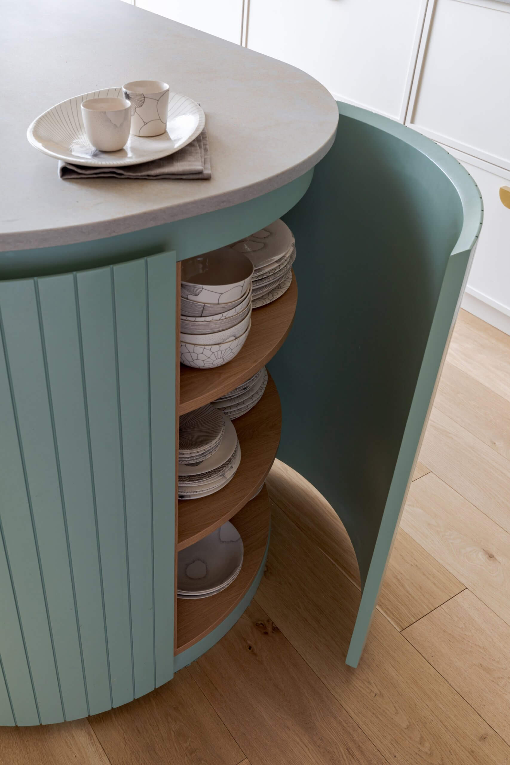
We Love: The bold curves in this project are a beautiful stand-out feature – from the drawer and cabinet handles to the end-cupboards on the floor cabinets and the rounded ends and support pedestal of the island.
Kitchen design and cabinetry, Kate Feather Kitchen Design, 4 Park Road, Teddington, TW11 OAA. Tel: 020 8255 1886. Follow Kate Feather on Instagram @katefeatherkitchendesign Cabinets are hand-painted, with slim Shaker fronts. The arched unit is quarter-cut oak veneer.
Surfaces, 4023 Topus Concrete, Caesarstone
Paint, Whitening 41 and Aquamarine Deep 198, Little Greene
Tap, Flex by Quooker
Re-finished by Yardley Bespoke – there Insta is @yardley_bms
Handles, Lo & Co
Hob, Bora
Photography, Birgit Mons
Share this article
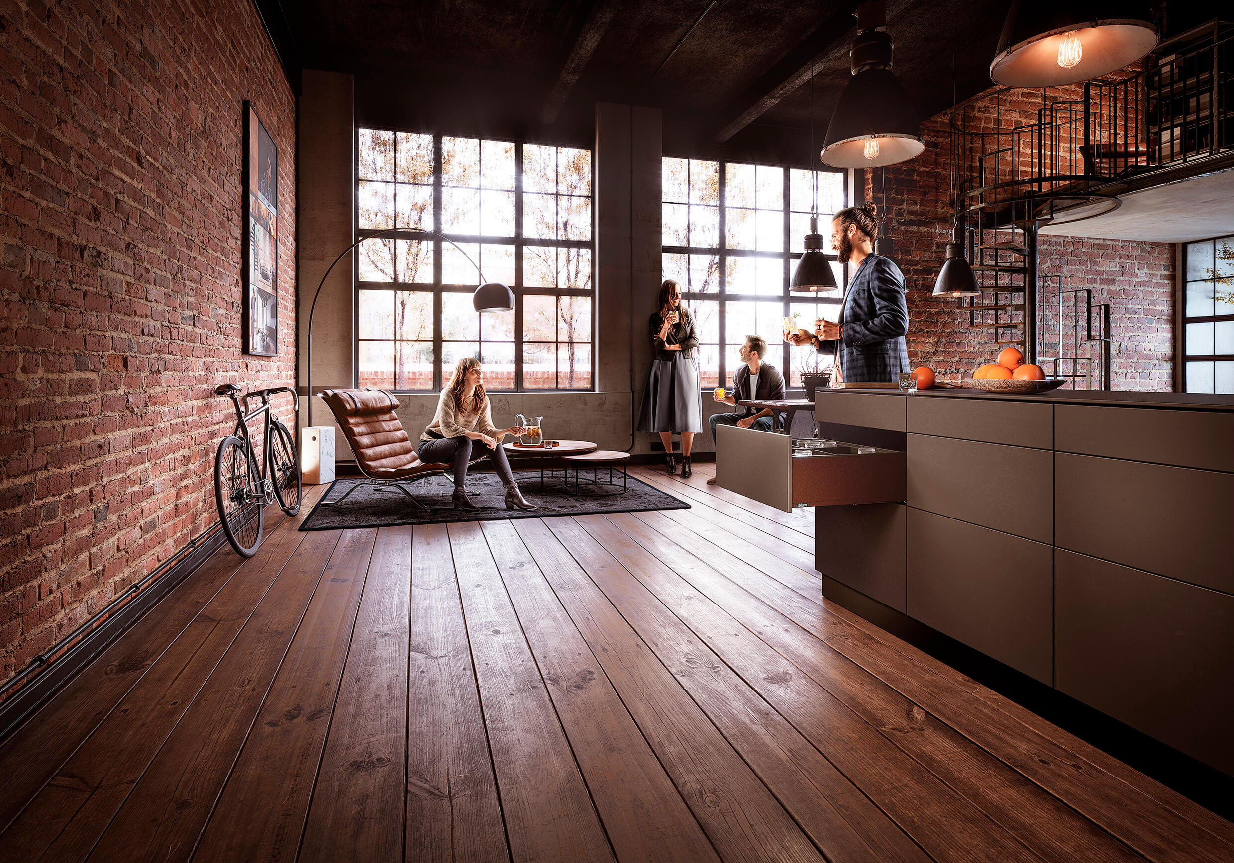
Featured Product: LEGRABOX
Win a Blum ORGA-LINE box worth £320!!!
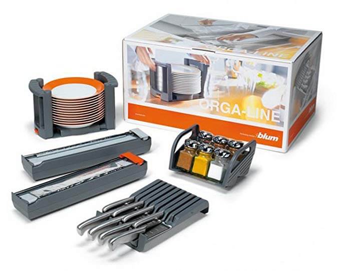
Every month The Kitchen Think is giving away one of these indispensable kitchen organisers worth £320!!


Leave a comment