
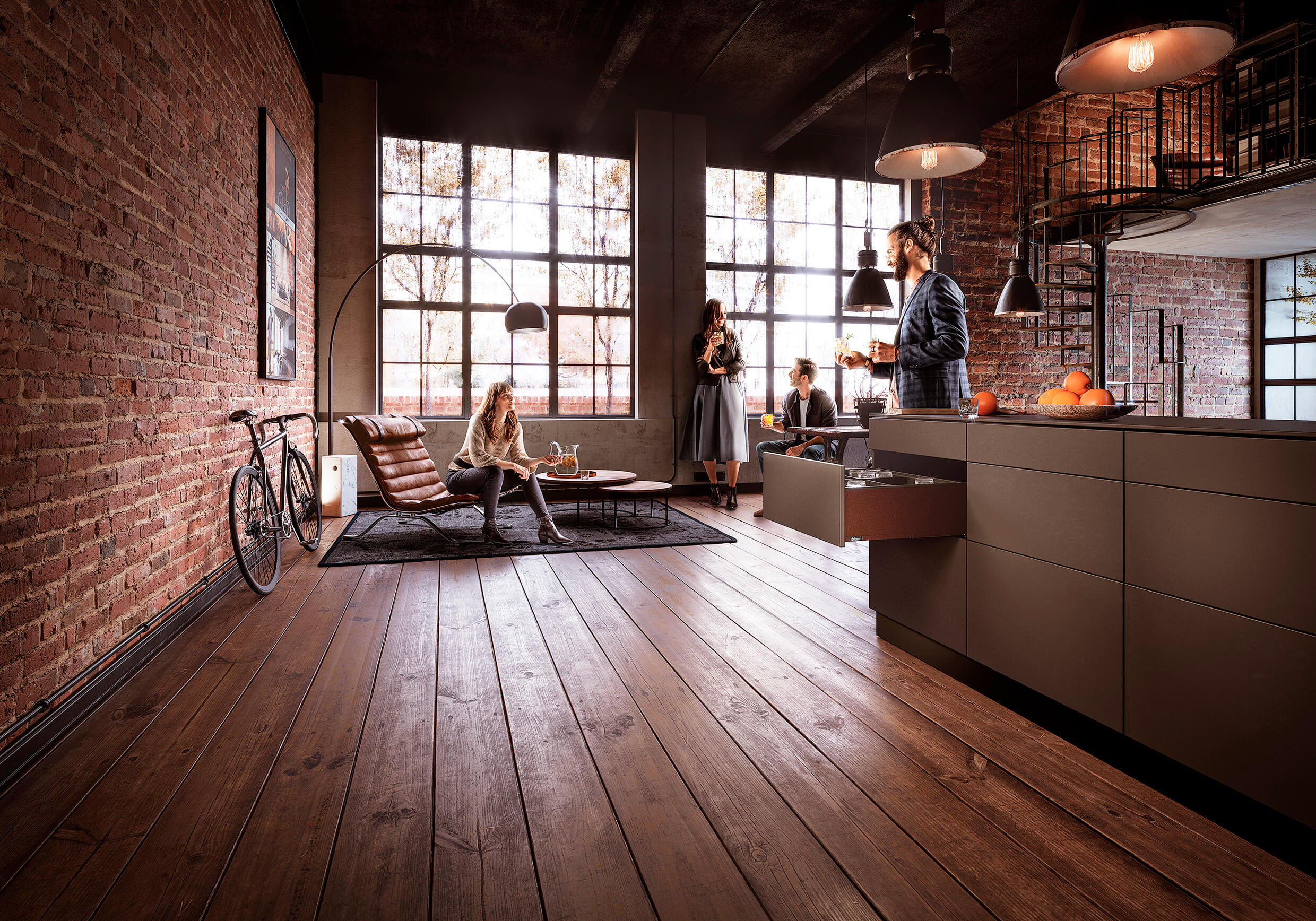
Harvey Jones: A beautiful kitchen with natural tones and textures
By Linda Parker
 Melissa Klink, Head of Design at Harvey Jones was asked to design a family-friendly kitchen for a couple and their semi-detached Victorian house in South-East London. They were embarking on a huge task – a full renovation and kitchen extension to a house that hadn’t been touched for many years …
Q: What were the stand-out priorities in your brief from your clients?
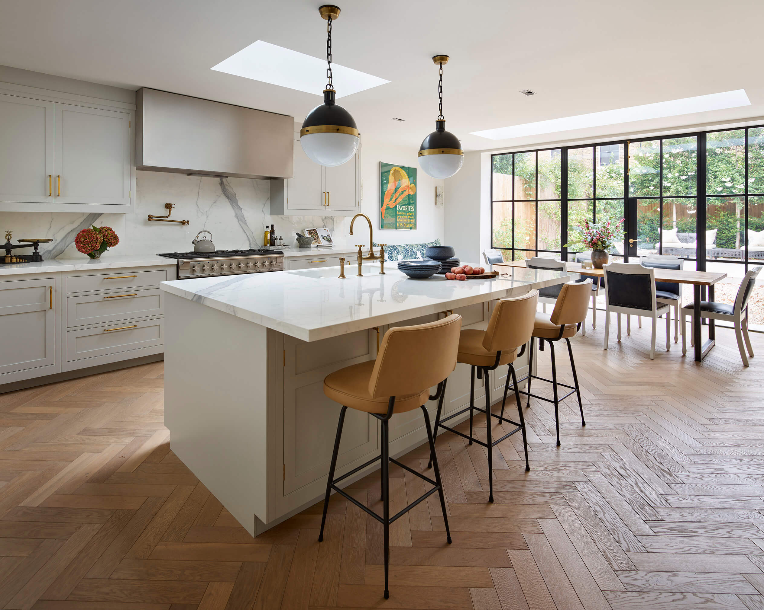
They wanted space, light and a classic contemporary look that would stand the test of time both in an aesthetic and a practical sense – all perfectly achievable in what was clearly a great space. The kitchen was un-extended when our clients bought the property, so they had gained a lot of additional space by extending to the rear and into the side return. They were very keen to dedicate the whole room to the kitchen and not try to squeeze a living area into it too, as seems to be the case so often in Victorian side return extensions. There is a lovely reception room at the front of the house that is used daily, so they didn’t want to lose the functionality of that and end up living in the back of the house only.
Q: How did you set about answering that brief? Were you given a strict budget?
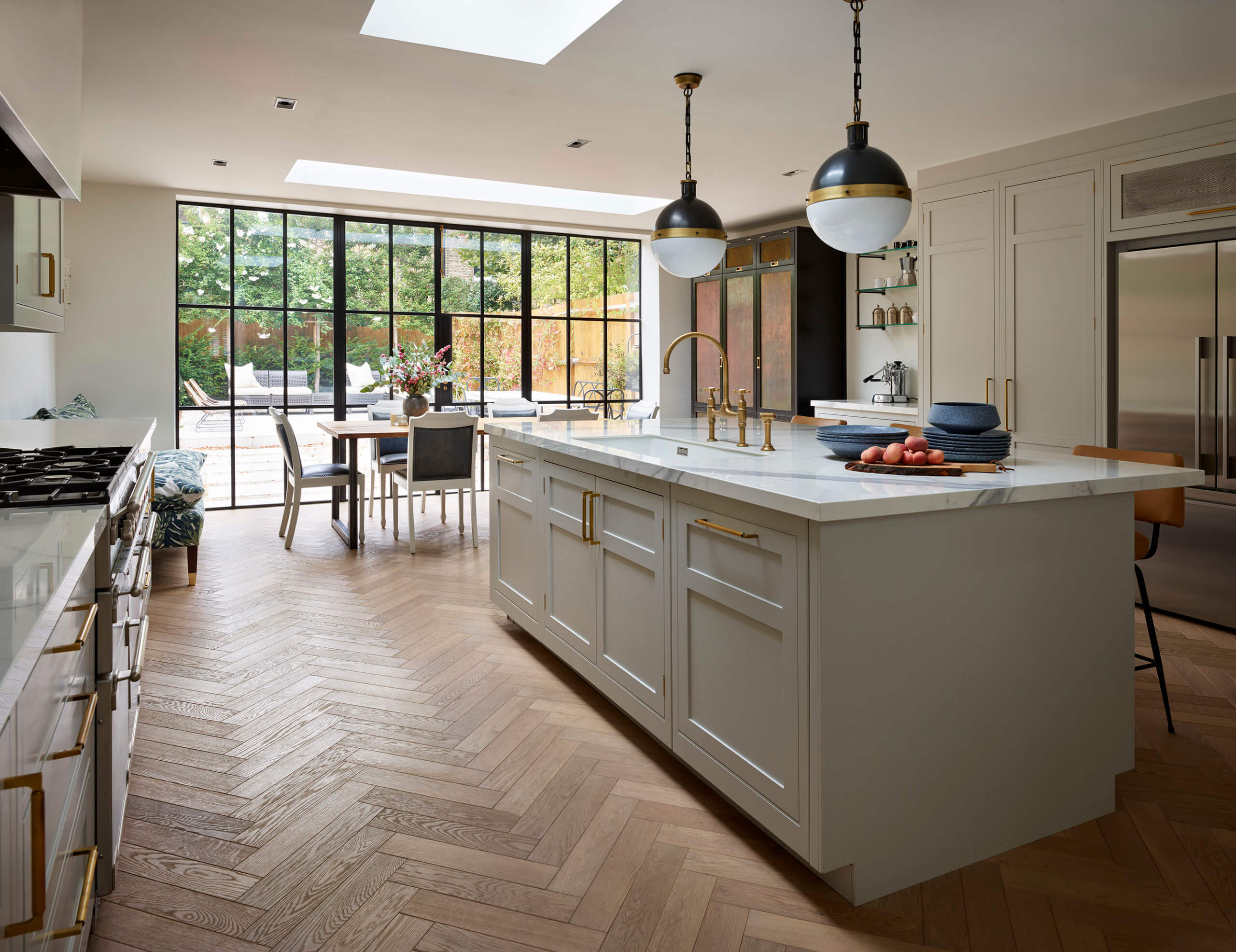
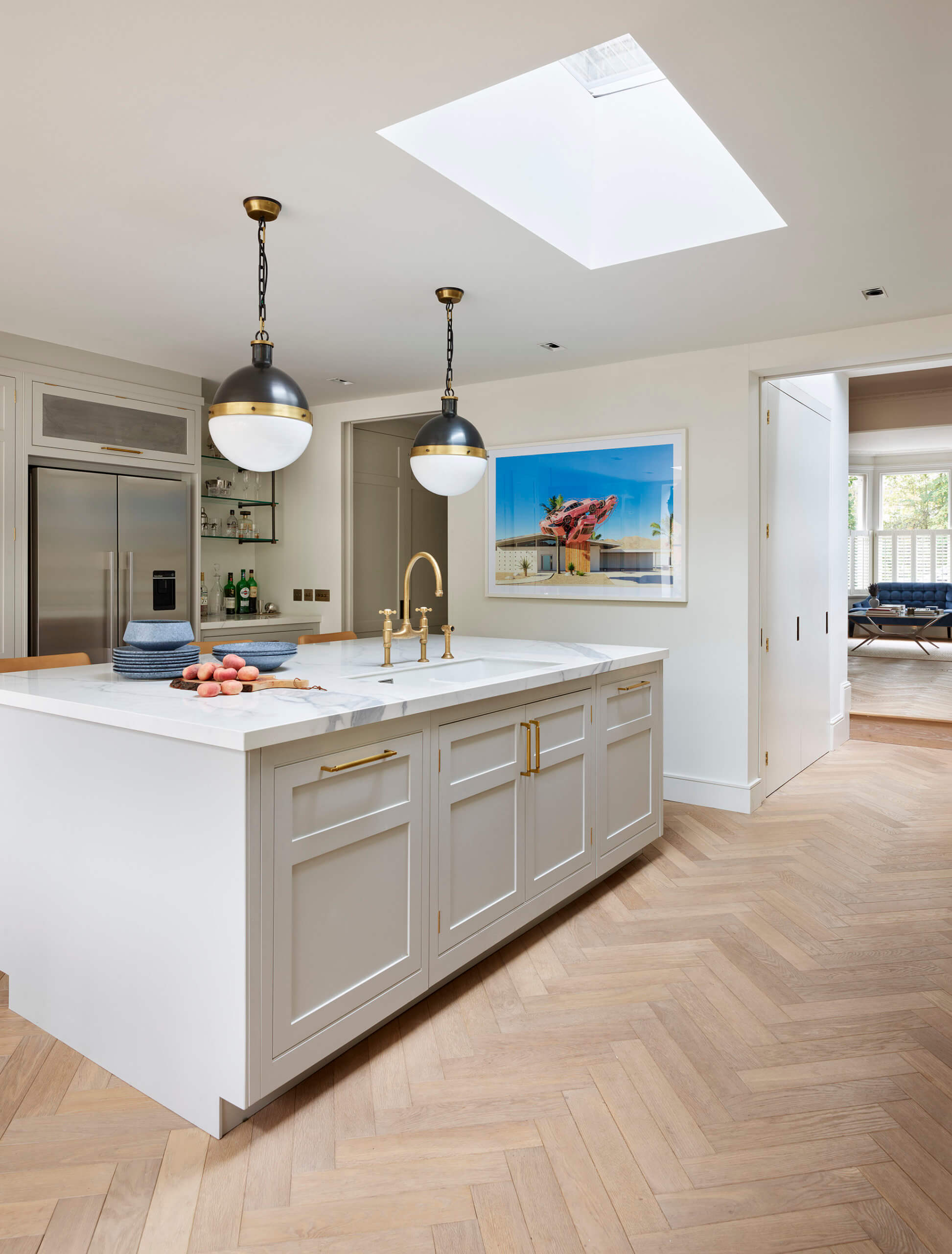
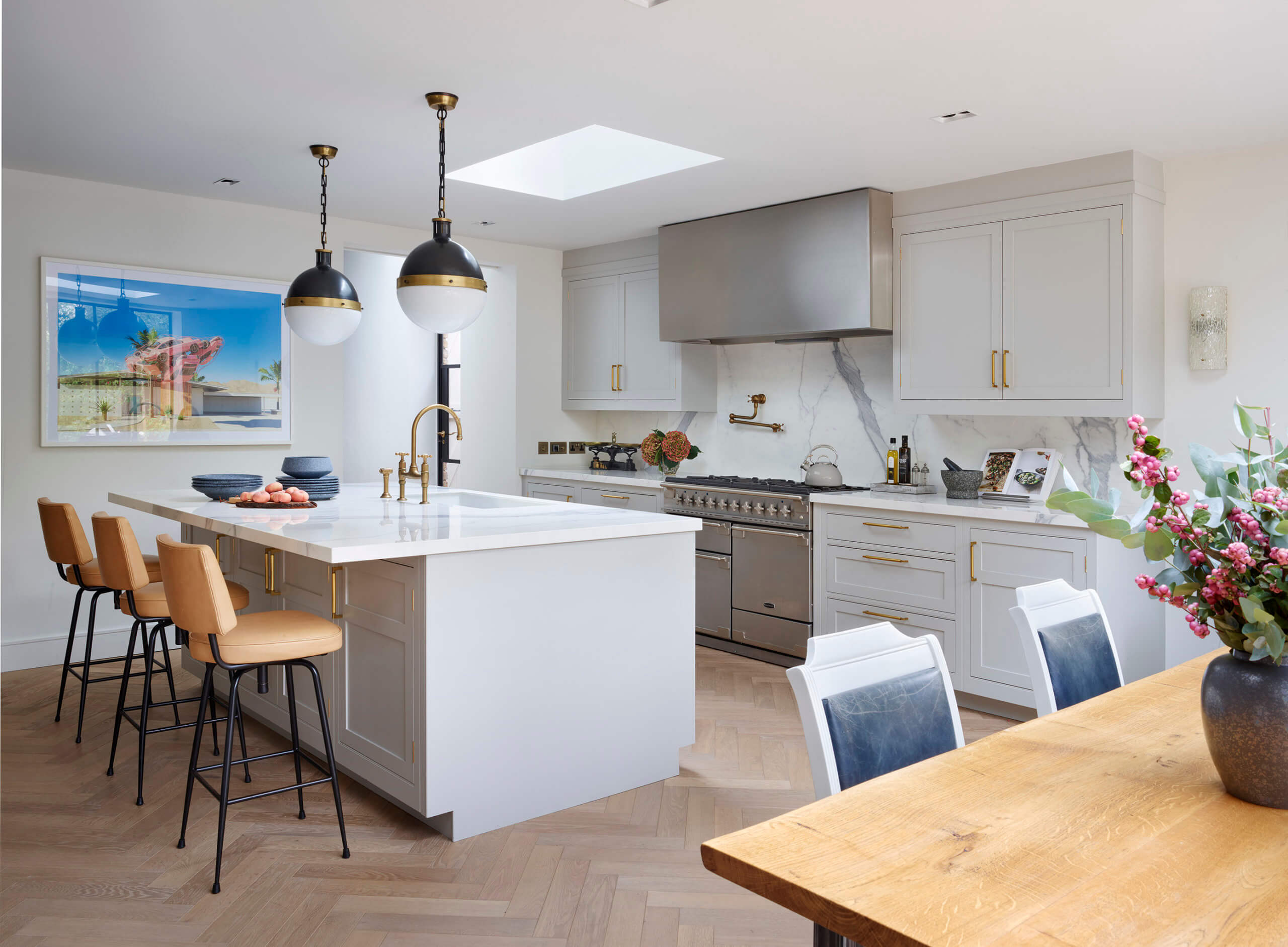
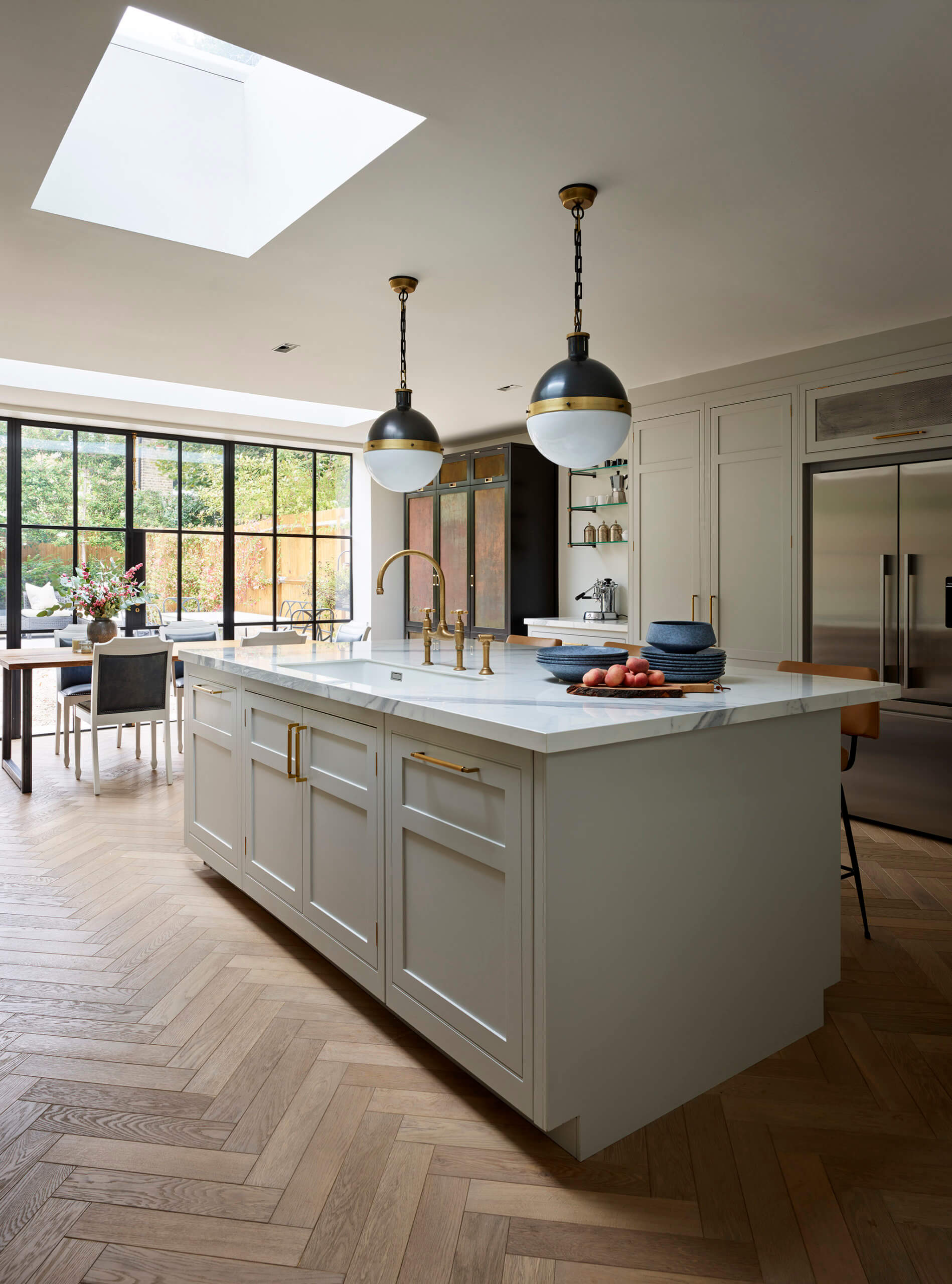
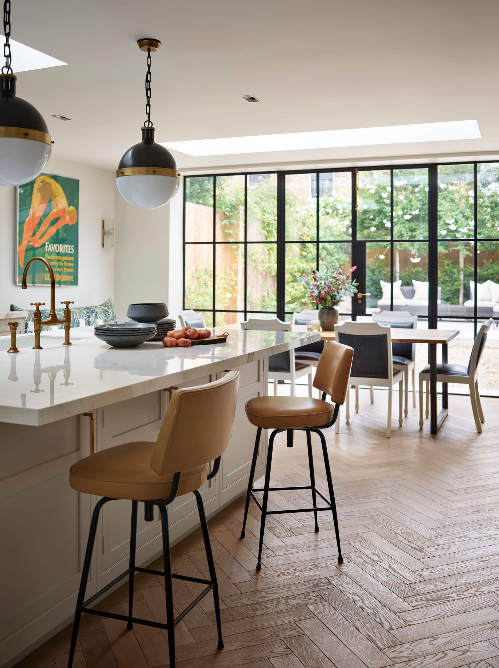
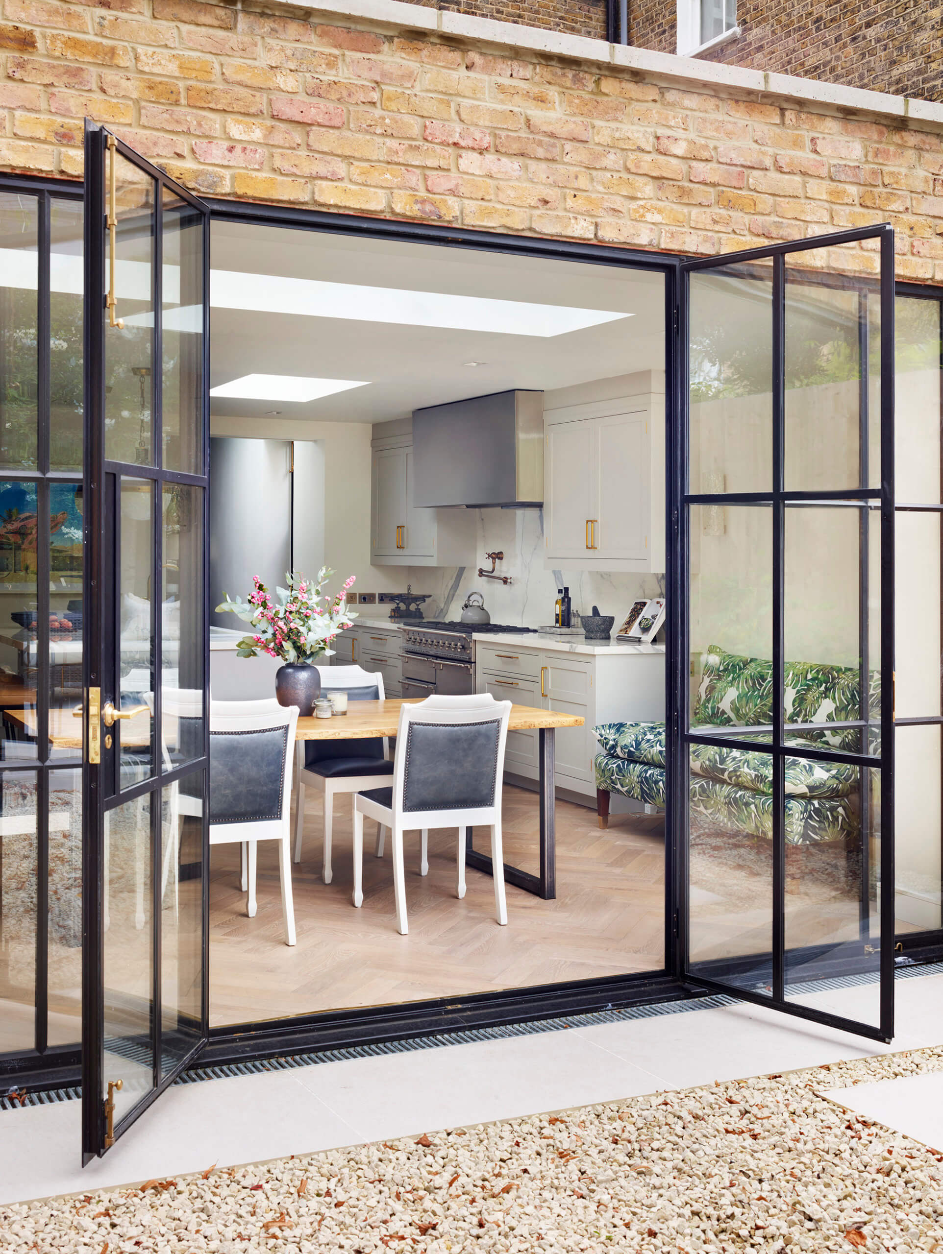
The main issue with the old kitchen was the lack of light. The original space used to be so dark, on the sunniest of days the homeowners had to turn on all the downlights. Thanks to the extension, three large flat rooflights flood the room with natural light, and the full-width wall of steel frame doors really opens up the view of the garden.
The extension also made the space much larger, so we had enough room to fit a big island with stools and somewhere comfortable to sit and enjoy a meal together as a family. As the kitchen makeover was part of a bigger ground floor renovation, there was no strict budget.
Q: Explain the reasons behind the choices of cabinetry and work surfaces …
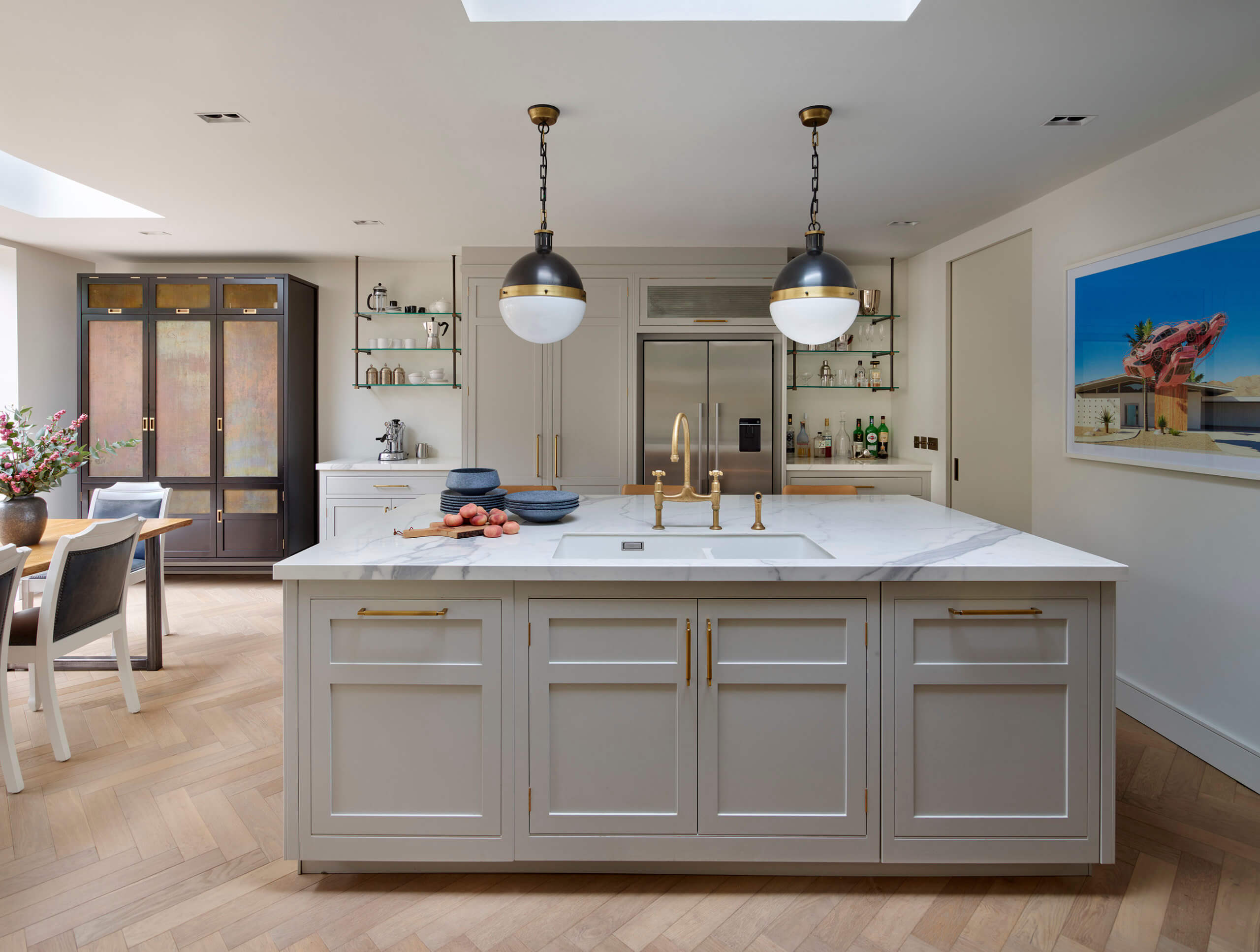
The kitchen is classic and timeless, but our clients Holly and Ross were keen that the architectural backdrop felt contemporary. The steels are buried in the ceiling to give a clean finish and the rooflights appear like sharp slots that intersect it. The skirtings, the downlight fittings and the sliding pocket doors all create a clean, linear and contemporary style.
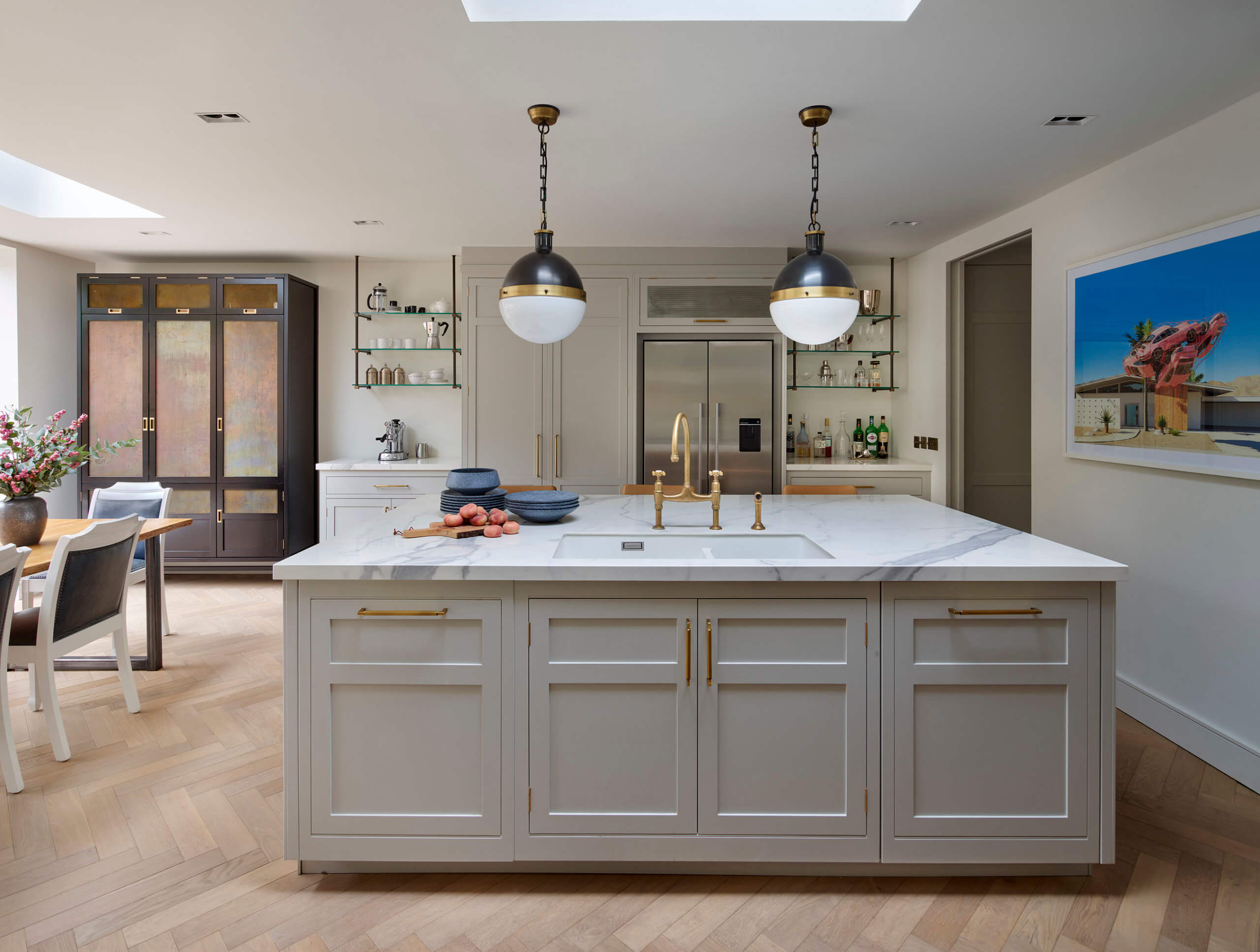
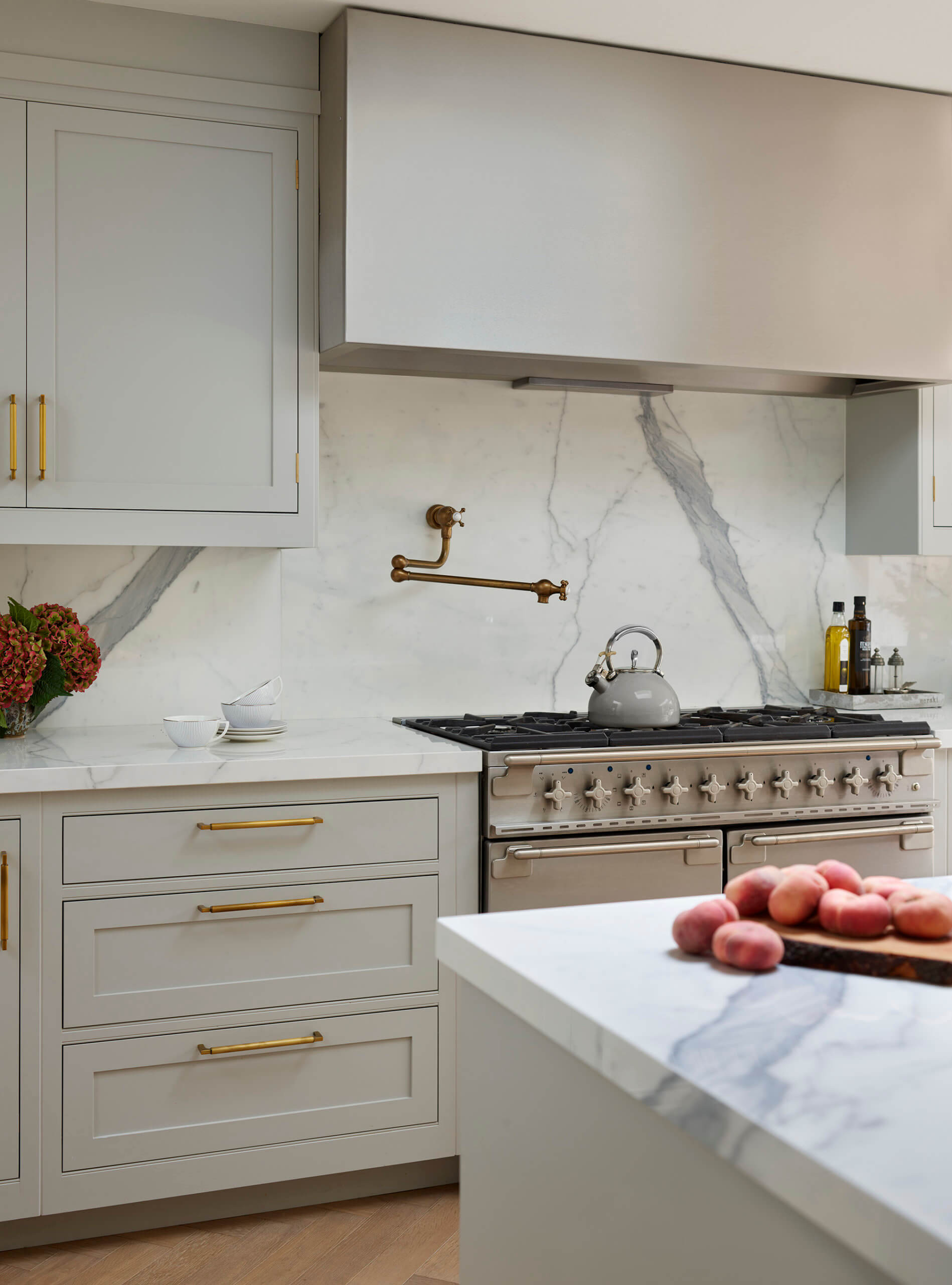
The kitchen cabinets are classic Shaker style. The rails are slim and elegant with a tiny bullnose detail at the top and bottom for a hand-crafted look. The owners wanted marble countertops and brass accents to add glamour to the overall look, so they sourced brass handles from America for the cabinets and selected aged brass finish for the tapware.
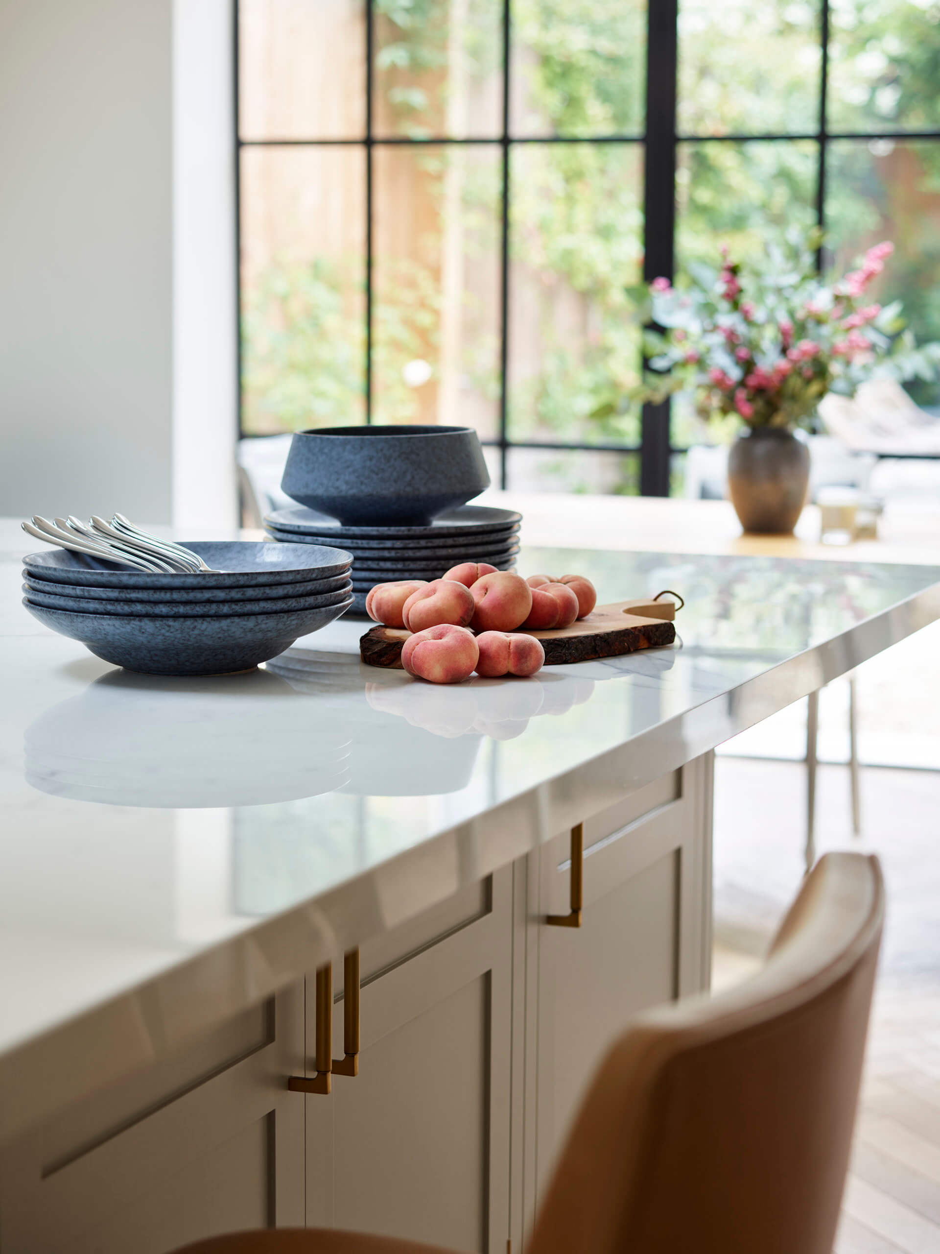
One look they were really keen to achieve was that of a beautiful veined marble. However, both the owners are keen cooks and the worktop was going to be put through its paces, so they needed a bulletproof, practical material and unfortunately marble just wasn’t going to be suitable. Instead we opted for durable porcelain, which has the veining of Statuario marble, but is digitally printed. We found the best on the market from Kinorigo – it looks so real, with mitred edges and expert pattern matching. The giant sheet size means we’re working within the same constraints as real marble so there are no additional tell-tale joints.
Q: Was there any building/renovation work involved? Did you have any restrictions or limitations that you had to work around?
The kitchen was extended to the rear and into the side return, and consequently, we had no limitations or existing structural issues that we had to work with or around!
Q: What design elements do you think make the scheme so successful?
Personally, I love how full of character the space is. We worked closely with the homeowners, particularly Holly Stone, who works as an interior designer. She sourced many pieces herself – Twenties Murano wall lights, framed vintage posters and mid-century Italian bar stools reupholstered in soft tan leather. In her projects Holly likes to mix in vintage items and eclectic art, so she was keen to ensure the kitchen featured those elements too. The result is a kitchen that really represents the sophisticated and timeless style of the owners, blending modern and traditional seamlessly. Another personal touch is given by the commercial-grade stainless-steel extractor, specifically requested by Ross, who is a very keen cook. This kitchen really is completely tailored to the clients’ taste and needs.
Q: Now the project is finished, what aspects are you (or the client) most pleased with?!
I think the main aspect has to be the balance of the kitchen that comes from its symmetry, which is so important. Style-wise, the architectural backdrop is contemporary while the kitchen cabinets, appliances and tapware are more classic and the owners love the mix of the two. Getting the right mix and balance can be tricky, but I find the overall aesthetic is more interesting than just following a specific look wholeheartedly. Holly approaches art in a similar way by mixing genres and styles. She bought the large contemporary photograph of pink 911 Porsches for her husband who is crazy about cars, whilst the other artwork is a vintage poster that used to hang in her childhood home. Either side of the poster hang 1920s Italian Murano wall lights – introducing authentic vintage pieces adds real character to an interior.
Q: What is your best advice for someone who is planning a new kitchen, what key points should they think about?
Always start with what the overall style and look you’re hoping to achieve in your new kitchen, as this helps determine the layout. For example, do you prefer a traditional layout, or can we create something more unique and modern? When it comes to choosing the style of your kitchen and the look of your cabinets, ask yourself what design will work in your home and will you be happy with it in the next five, ten or even twenty years. I think hand-painted furniture is a great way to ensure the cabinetry can be adapted as trends and colour preferences change. Ensuring the design of the door is not overly detailed will keep the cabinetry timeless, while the option to change the colours over time means you can future-proof your space, giving flexibility for the overall scheme.
After deciding preferences for main appliance types – integrated or freestanding, you can then decide with your designer how best to highlight these areas and make a feature of them, or how to discreetly hide the appliances .
Q: Do you have a secret ‘style signature’ that you find you use in most of your kitchen projects?
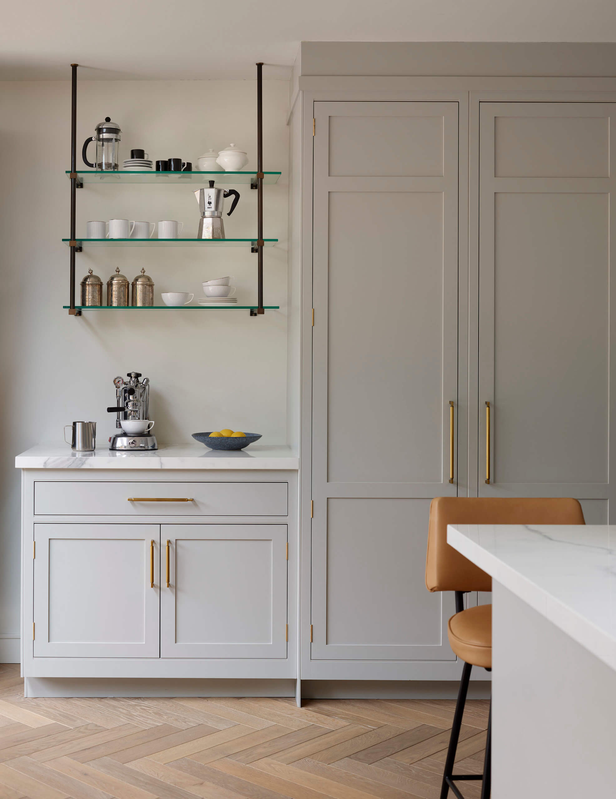
I always try to conceal elements which are messy – things like rubbish and recycling bins. Also, dry good areas are often best kept behind closed doors within larders and dressers.
The best way to hide elements that you don’t want on display is to conceal them behind cupboard doors. Keeping plug-in appliances and smaller items that clutter up the aesthetic put away helps the overall kitchen space remain clean. A kitchen without clutter is easier to use for daily tasks …
The size of the kitchen does not matter as long as you get the organisation right. Taking the time to properly organize your kitchen by function and use is key to maintaining a clean look. The right designer will be able to guide you through all the details to ensure the way you use a kitchen is appropriate for the layout.
We Love: The exciting and colourful artworks, chosen as a fantastic contrast to the subtlety of the kitchen itself
Original painted Shaker kitchen by Harvey Jones 0800 389 6938, painted in Pavilion Gray by Farrow & Ball
Range cooker, Rangemaster
Double door fridge, Fisher & Paykel
Taps, Perrin & Rowe
Digitally printed Statuario marble-look surfaces, Kinorigo
Hicks bronze pendants by Thomas O’Brien, Lightsource
Share this article
Featured Product: LEGRABOX
Win a Blum ORGA-LINE box worth £320!!!
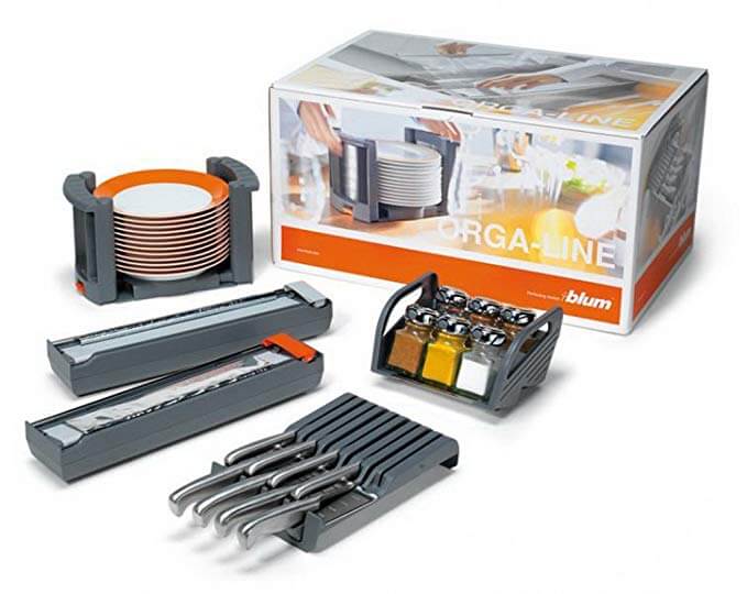
Every month The Kitchen Think is giving away one of these indispensable kitchen organisers worth £320!!


Leave a comment